Otago Design System
A design system for an ecosystem of 80+ web applications for public institutions in Poland. Over 50 components, four WCAG accessibility modes, one shared visual foundation.
View the interactive system ↗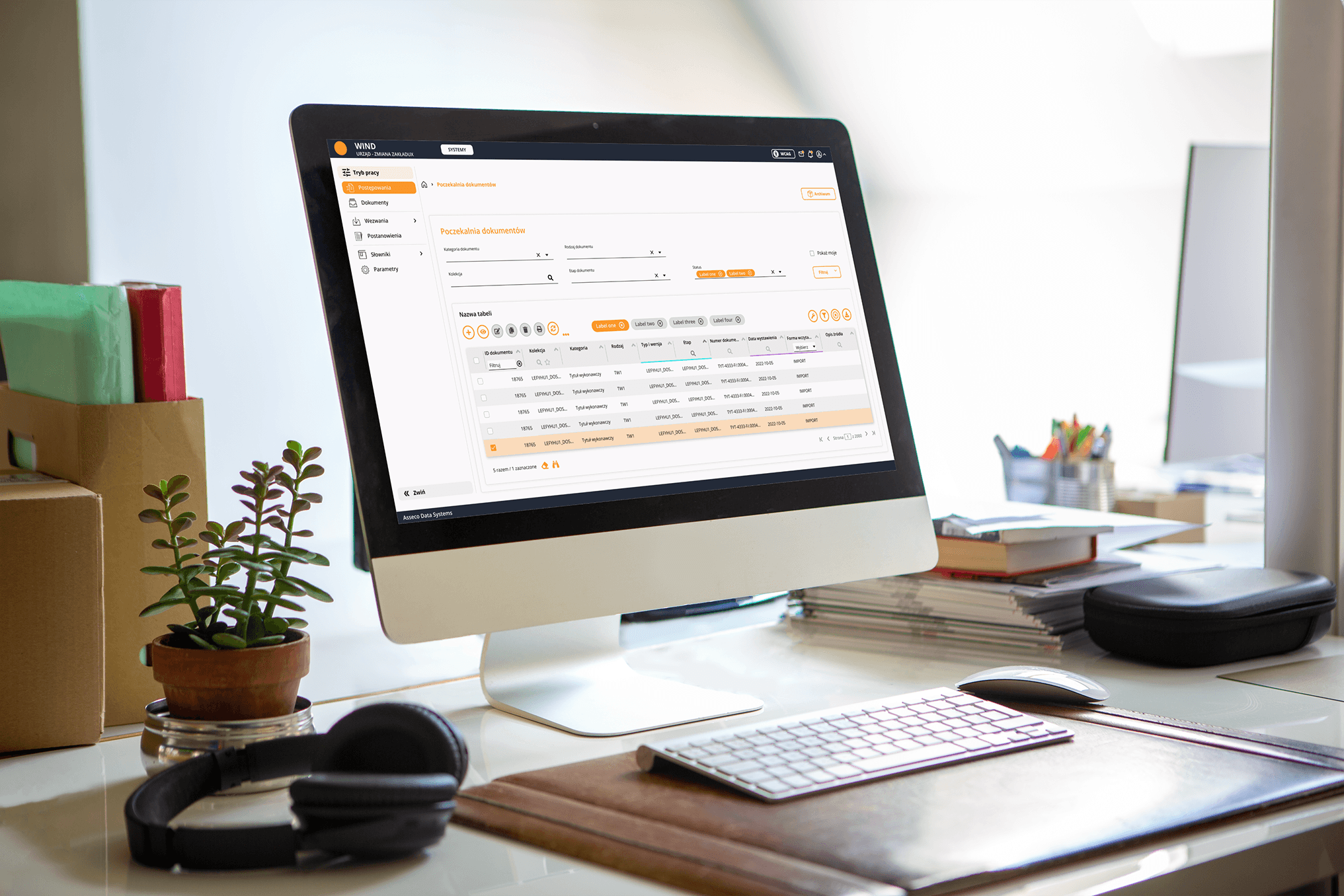
- Title
- Design System OTAGO365
- Industry
- B2B / Public sector
- Role
- UX Design, design system design, analytical documentation
- Tools
- Figma
- Date
- 2021–2025
Overview
For 4 years I designed the design system for an ecosystem of 80+ web applications by Asseco Data Systems serving public institutions in Poland. The result is a library of 50+ components in four WCAG accessibility modes, with analytical documentation for each of them.
The system doesn't look like a 2026 design system, because it was built between 2021 and 2025 for institutions where accessibility, stability and consistency are the priority. I'm keeping it here because working on an extensive ecosystem over several years is a different scale of experience than a single rollout.
→Scale
80+ web applications for city and municipal offices across Poland: public finance, taxes and fees, social benefits, HR, debt collection, property records.
→Problem
Components existed only as Angular code, with no design documentation or behavior rules. Every application looked and worked differently.
→Accessibility
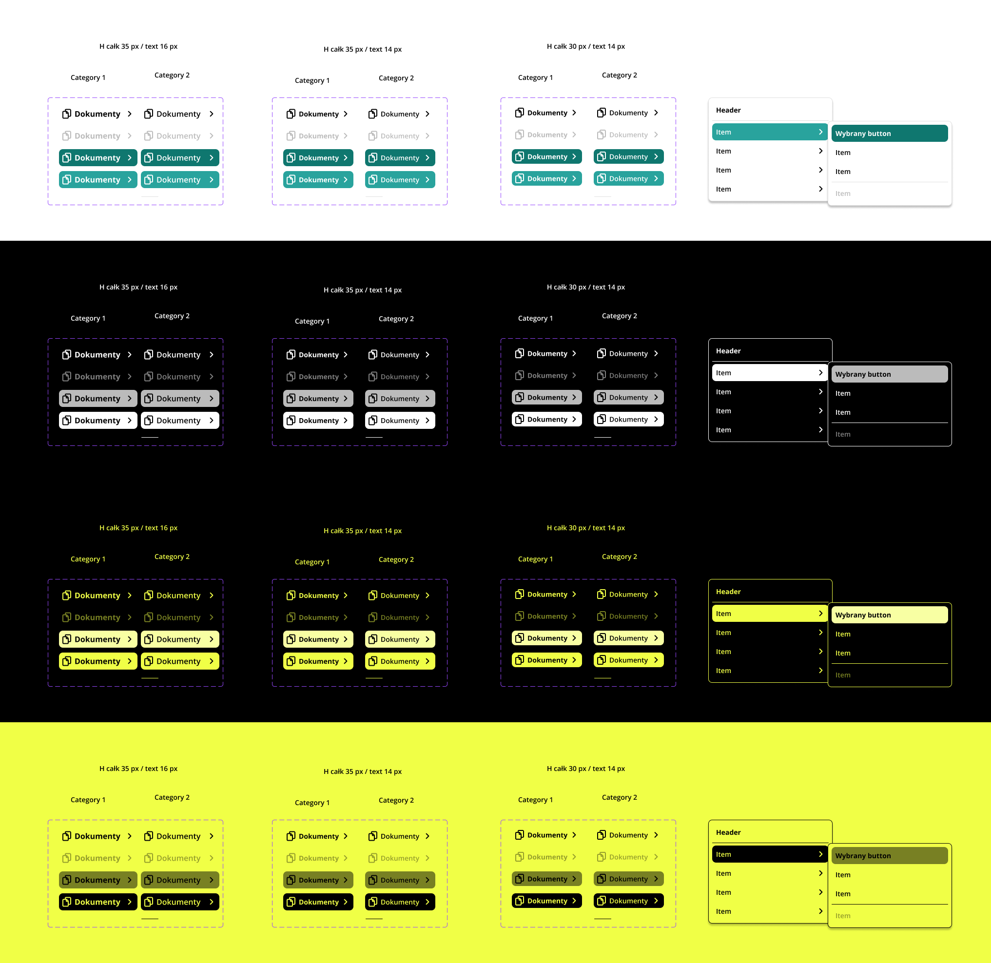
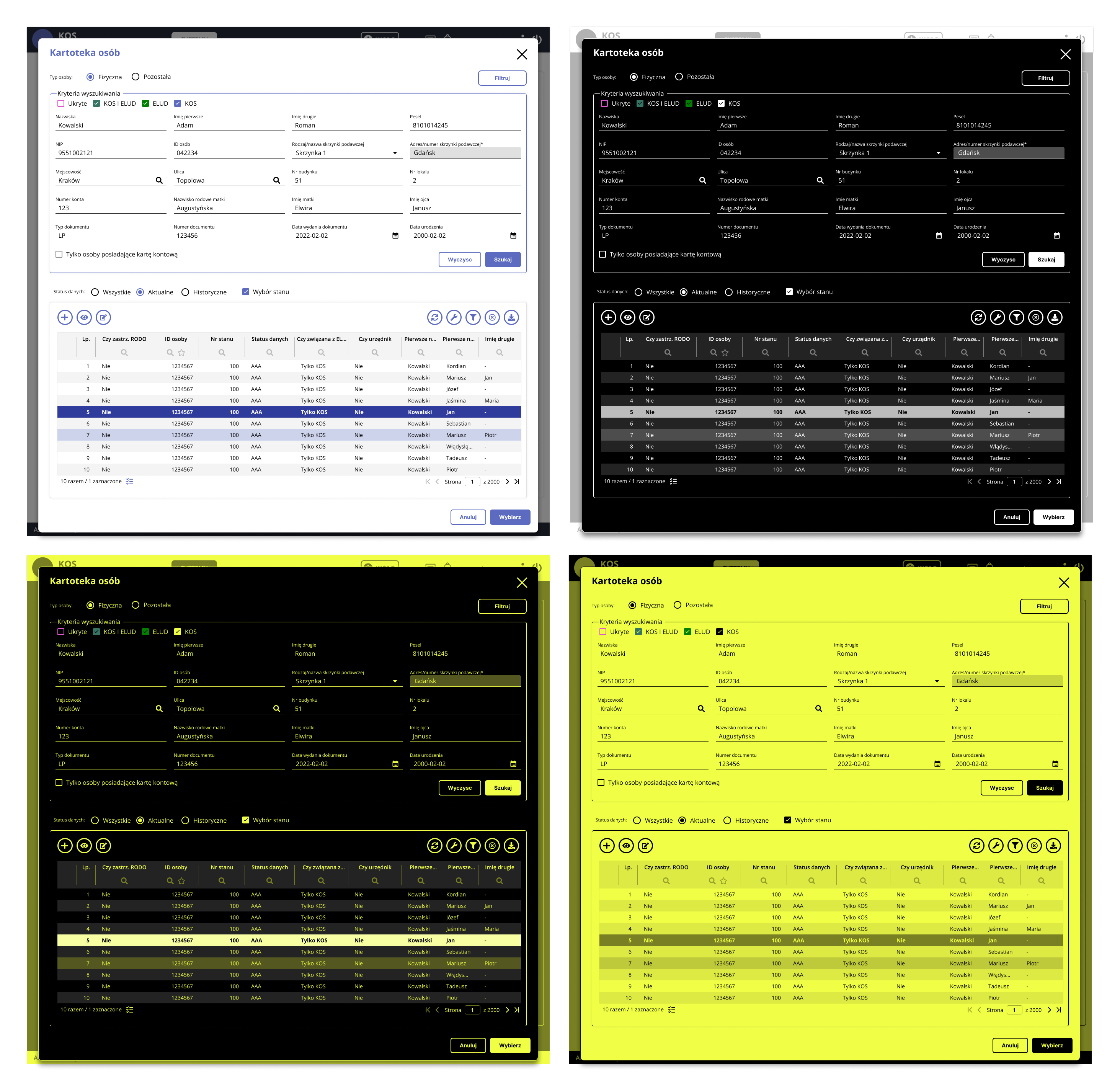
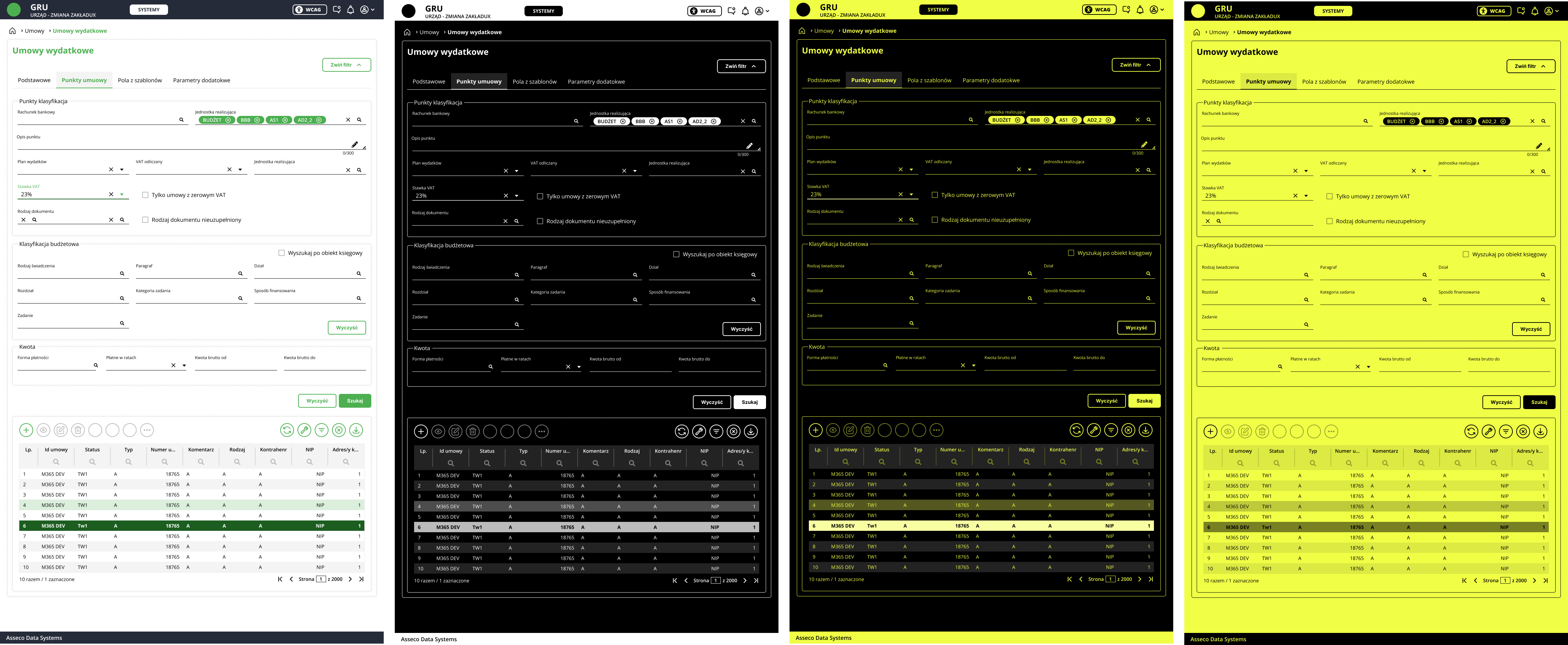
Public institutions require WCAG compliance. Four color modes designed from the foundations, every component verified across all four versions.
→Outcome
A shared library of 50+ components and one reference point for the whole ecosystem. The applications became one recognizable family.
Who it's for
A clerk working in several apps at once

Office clerk
end user
“I have several apps open at once, and the same thing looks and works differently in each.”
The system's user is an office clerk who, over the course of a day, works in several OTAGO apps in parallel. In one she checks a resident's data, in another she posts accounting entries, in a third she runs debt collection. She works with large amounts of data in lists, forms and reports that have to be searched, filled in and compared. She knows her domain very well, but she isn't a technical person and expects the system not to get in her way. Some of the clerks working with the system have poor eyesight, so contrast and legibility are a real need for them, not a formal requirement.
Previously each of these apps looked and behaved differently. Switching between them, the clerk landed each time on a different layout, different table filtering, a different place for the buttons. Even though it was one system, it didn't look like one whole.
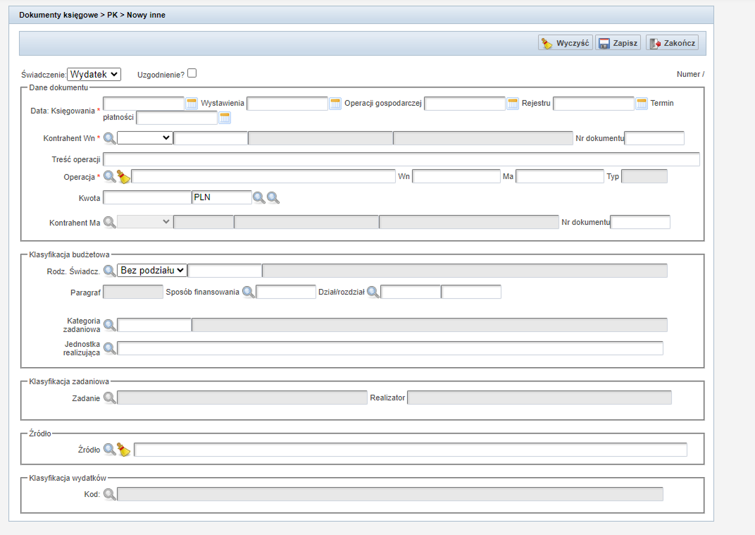
Problem
Before
The system serves city and municipal offices across Poland: public finance, taxes and fees, social benefits, HR management, debt collection and property records. Each functional area has its own application or set of applications, each with its own logic and requirements.
Before the design system, the apps in this ecosystem didn't form a coherent whole. Components existed on the developer side as Angular code, with no design documentation and no behavior rules. Each app evolved independently, so a change in one had no bearing on the others.
For the clerk this meant daily inconsistency: the same actions and the same data looked different in each app. A different button arrangement, a different way of filtering lists, different formats for national IDs, amounts and dates. Each app required getting used to from scratch, even though it was part of one system.
On top of that came a hard accessibility requirement. Public institutions must meet WCAG, and accessibility added at the end of a project never works as well as the kind built into the foundations.
Project goal
Bring the ecosystem to a state where all the applications look and behave like one family built on the same components.
It wasn't about reducing maintenance costs, but about consistency visible to the clerk and about WCAG compliance at the AA and AAA levels. Consistency was to be built into the system, not policed by hand in every app. Accessibility was to come from the foundations, not be tacked on at the end.
Key design decisions
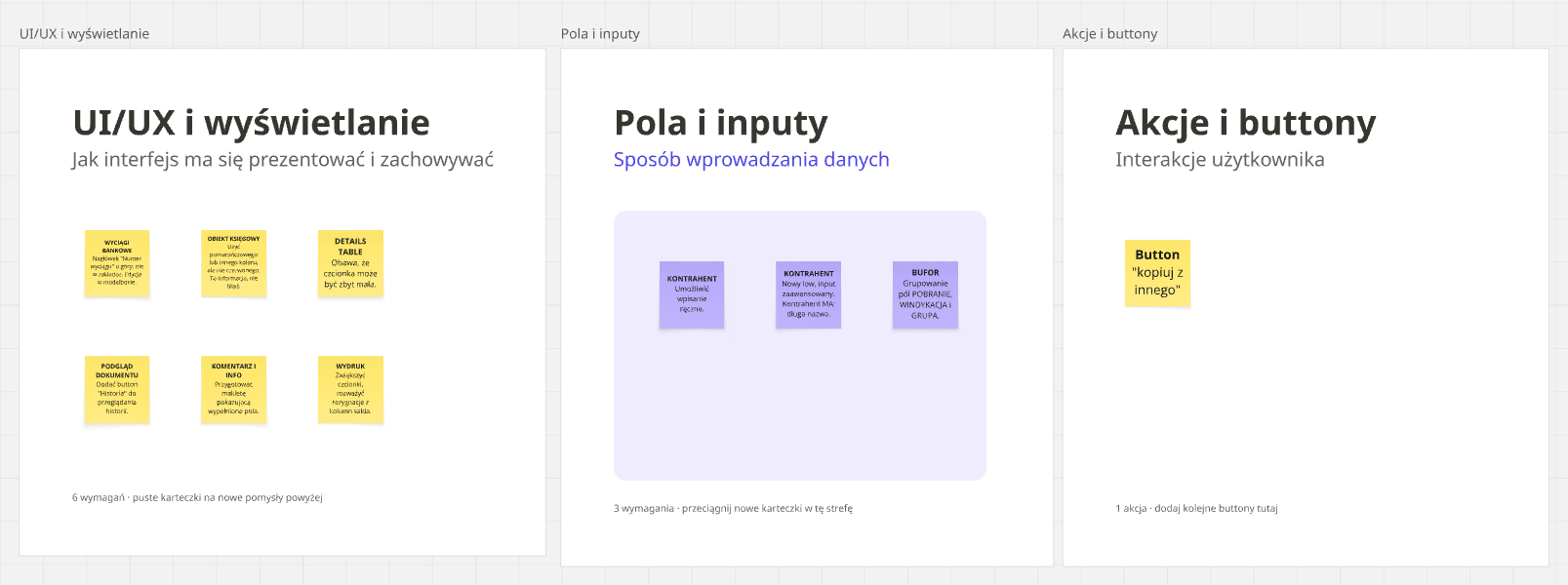
What most shaped how the system works
The library has over 50 components, from simple buttons and form fields to complex tables, modals and navigation. Below are the decisions that most shaped how the system works in practice.
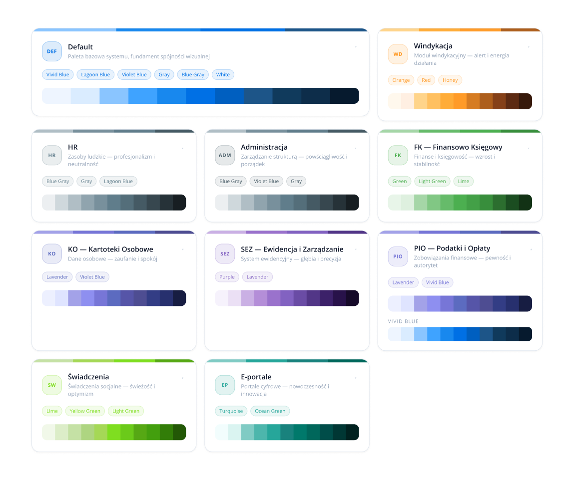
Organizing colors: Primary assigned to an area
Problem
There were a lot of colors in the ecosystem and they weren't organized. Many functional areas, several apps in each, with no clear rule about which color belonged to what.
Solution
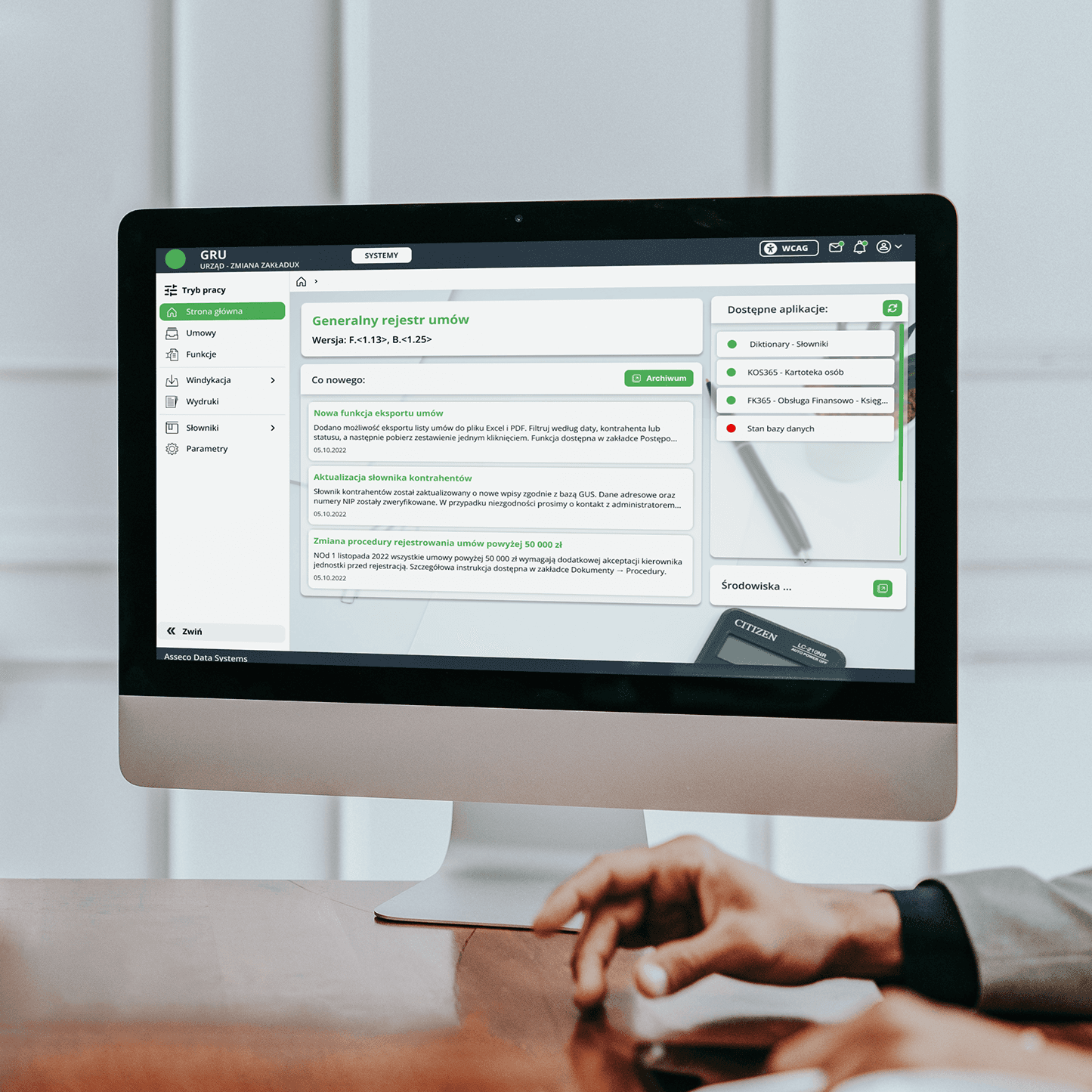
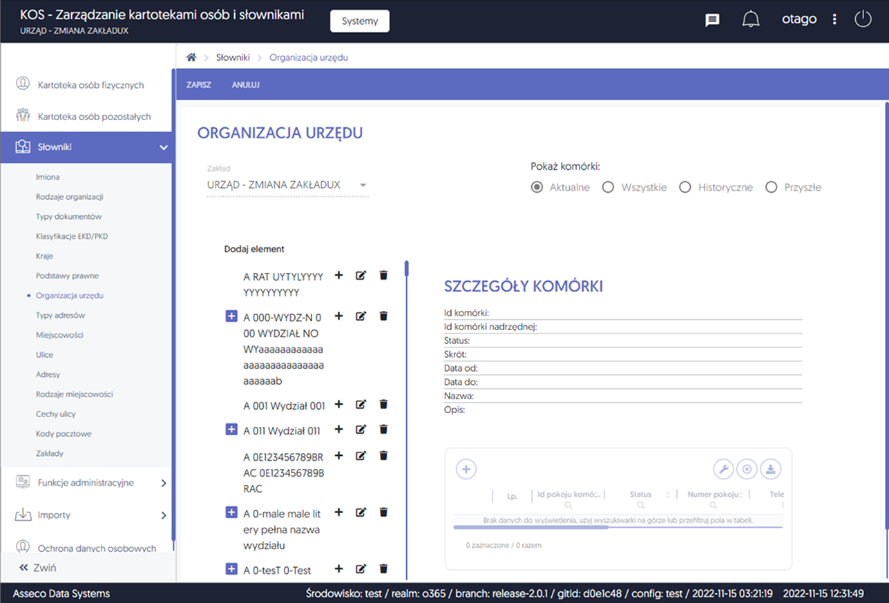
I organized the existing palette by assigning the Primary color to a functional area rather than to a single app, and defining it as a Figma style. Apps from one area became recognizable and consistent with each other, while all of them together use the same components. The area's identity is carried by color, not by a separate set of elements.
Four accessibility modes designed from the foundations
Problem
Some clerks have poor eyesight, and public institutions have hard WCAG requirements. A high-contrast mode glued on at the end doesn't solve the legibility problem.
Solution
Four color modes (standard, white on black, black on yellow, yellow on black) designed from the foundations. Every system color has a defined equivalent in each mode, so the developer doesn't have to guess how to translate a standard color into a contrasting one. In the contrast modes, semantic color coding is deliberately switched off, for example red for negative values, because on a black or yellow background it loses its meaning. Legibility mattered more here than aesthetic coding.
Shared behavior patterns and data formats
Problem
The same actions and the same data looked different in each app. A different place for buttons, a different way of filtering, different formats for national IDs, amounts and dates. With every switch, the user learned the system from scratch.
Solution
Unified patterns for the whole ecosystem. Fixed places for actions, a shared way of filtering and searching, defined masks and alignment rules for each data type. Amounts right-aligned with a thousands separator, fixed-length identifiers, dates in one format. A way of working learned once works in every app.
Analytical documentation for every component
Problem
Components previously existed only as code, with no description of behaviors and states. Some rollouts were done by a team that couldn't be reached quickly, so the design couldn't leave room for guesswork.
Solution
Every component got an analytical document with visual and functional assumptions: variants, states, behavior across four modes, interaction rules. The scale could be large, the documentation of the table alone is dozens of pages of specification, but thanks to that the rollout could proceed without questions.
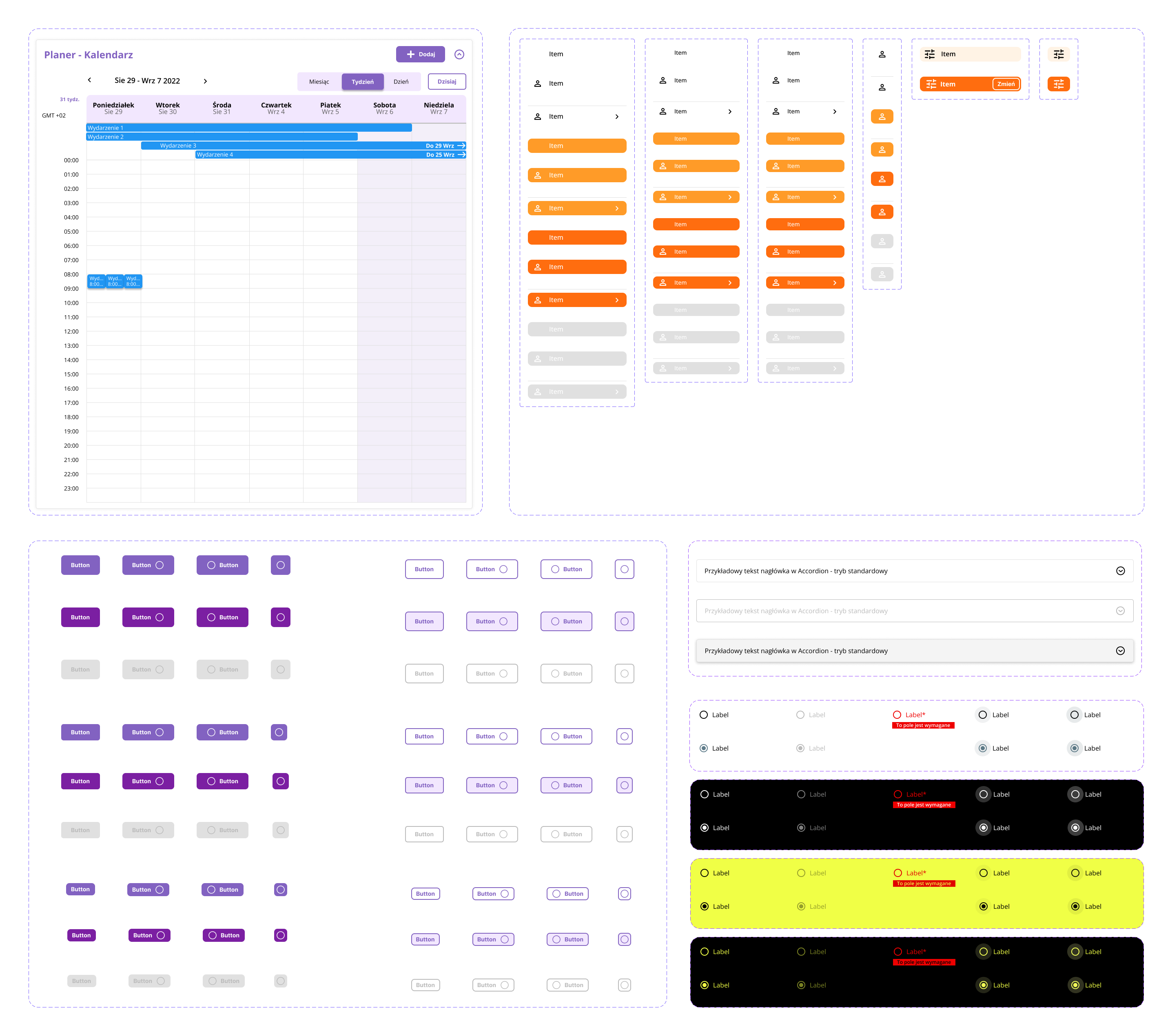
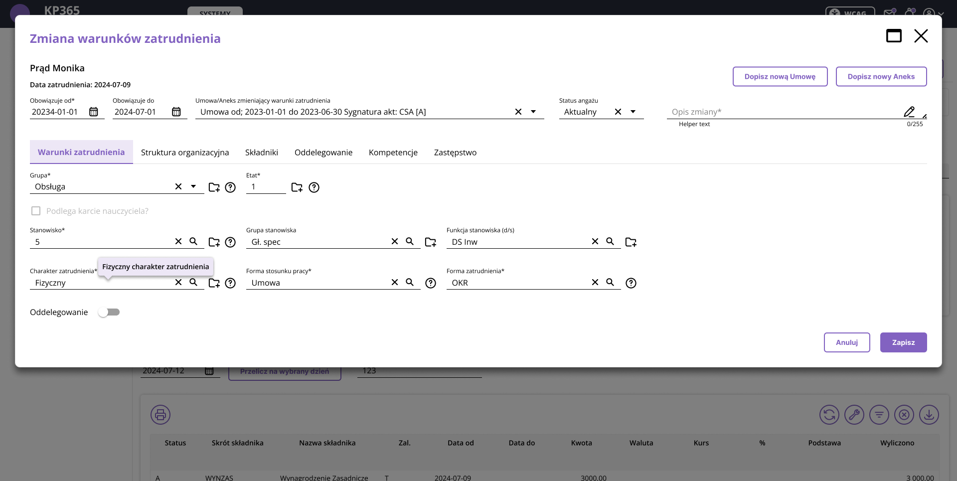
Interactive design system
Browse the system live
Below is an interactive preview of the system: components, area colors and palettes. Click through the tabs to move between views.
Rollout and UX flows
Not just a new look, but a better process
Swapping components in existing apps wasn't just about replacing the visual layer. With every rollout I analyzed the UX flows around the new component and checked whether the process logic around it was still valid. Where a pattern had accumulated over the years without revision, I proposed a simplification and agreed it with the team.
Accounting document item screen
Before: the same screen in three forms
The same screen, adding and editing an accounting document item, existed in several apps in different forms. A different layout, different names, a different arrangement of fields and actions. A clerk moving between apps landed each time on a different version of the same task.
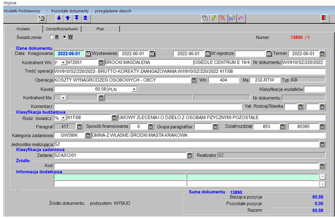
Conversations with the clerks
Before the new version was made, I met with clerks who work on this screen every day. In joint meetings in August 2023 I gathered specific problems and questions: what to name the screen, where they expect the button, which fields are confusing, what's missing. Some of the reports concerned things you can't see from a designer's perspective:
- →the “Back” button was to go on the action bar, far left, because that's where they looked for it
- →the “accounting object” was to be marked in a color other than red, because it's information, not an error
- →the Collection, Debt-collection and Group fields were to be grouped together
- →the contractor had to be enterable by hand, not just selectable from a dictionary
- →the font in the details table was too small for daily work
After: one consistent mockup
One mockup emerged: the item table on the left, the details form on the right, with a fixed action layout and a separation of preview mode from edit mode. From then on the same pattern could work in other apps where the screen had previously looked different.
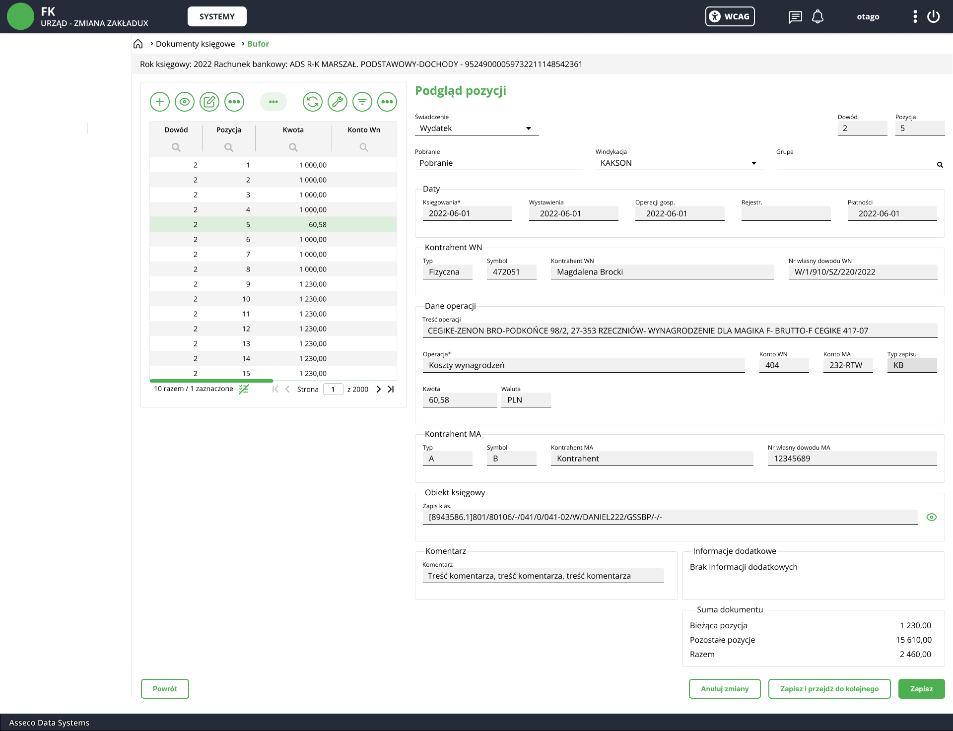
This shows what changed beyond the visual layer: the order and grouping of fields, the place of actions, the way data is entered, distinguishing information from an error. The decisions came from how the clerks actually work, not from a mere visual refresh.
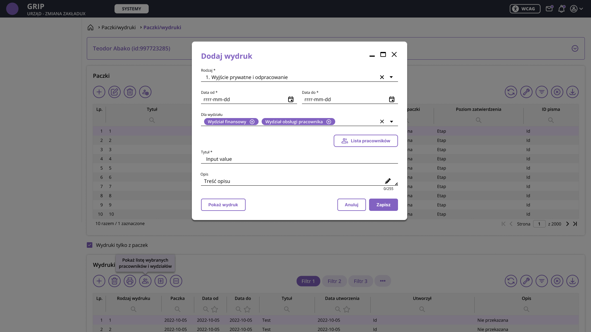
Printouts and batches
The new system had to take over generating printouts for selected employees, and at the same time rebuild the entire printout component so that it supported different formats (PDF, Excel, CSV, XML) and worked consistently with the rest of the system. I agreed the solution with the product manager and consulted a developer who knew the old app.
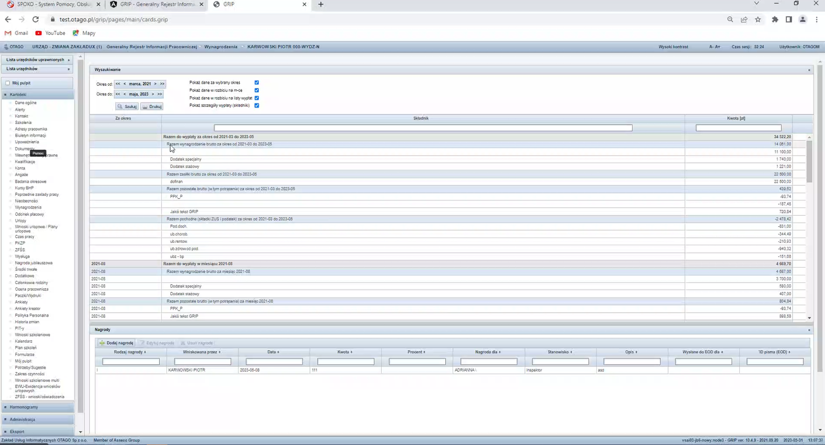
Before: a three-step process
In the old GRIP the printout was tied to the employee list on every record card, and the process ran in three steps: first preparing the report, then a preview, only at the end a save. The interface was dense and scattered.
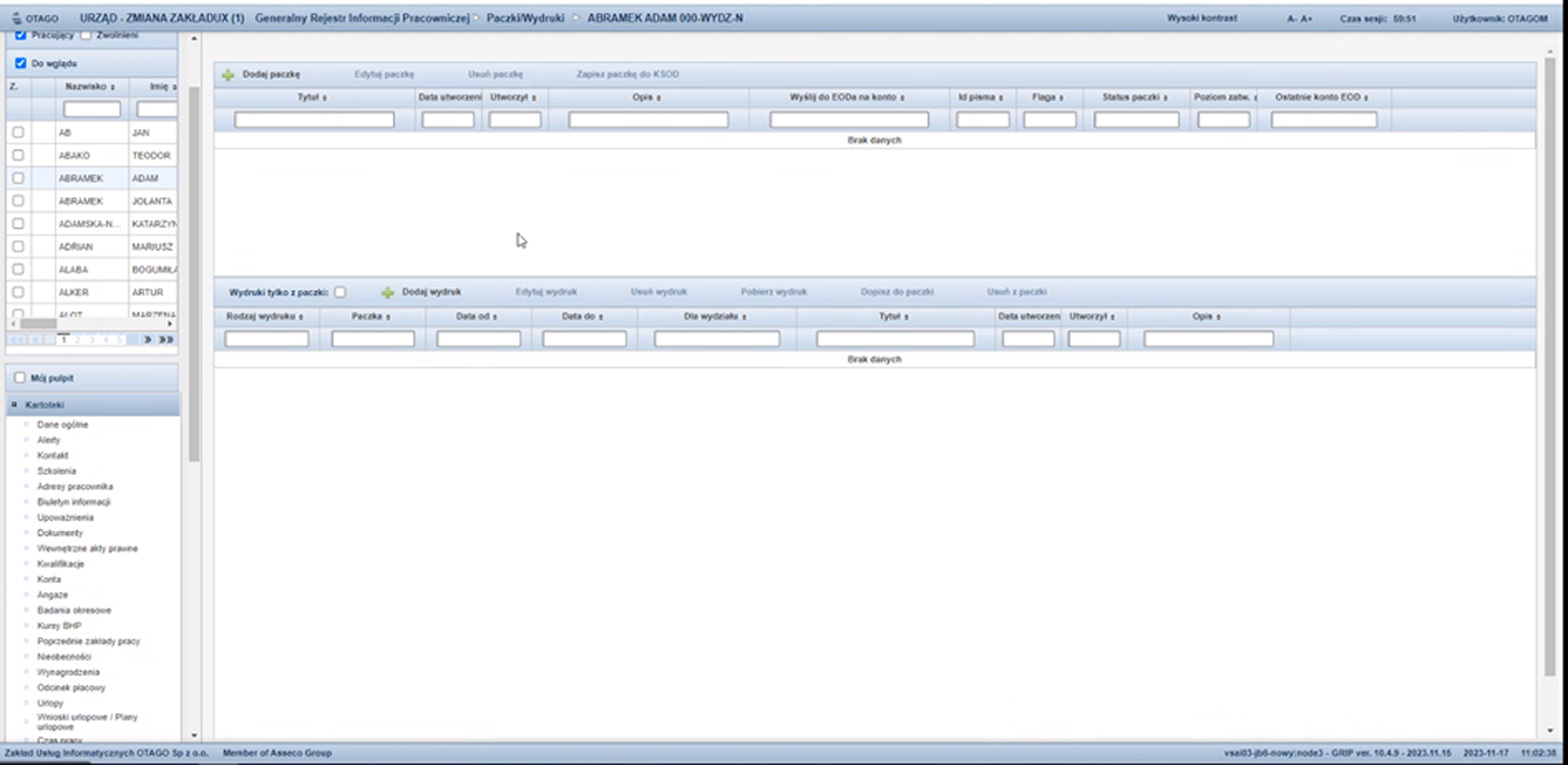
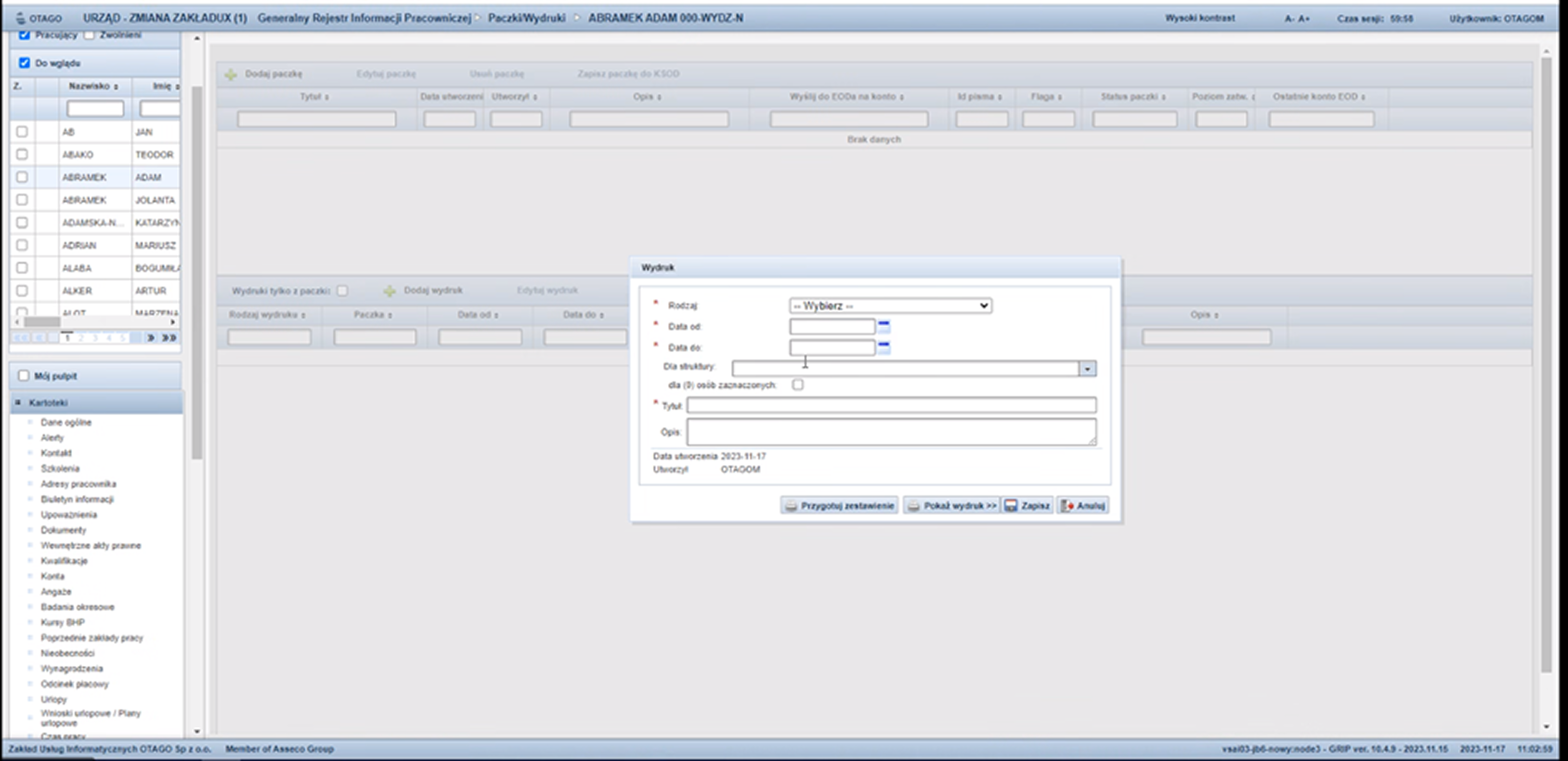
What I changed
- →I separated printouts from the employee list and gathered them into one rebuilt component, keeping the grouping into batches.
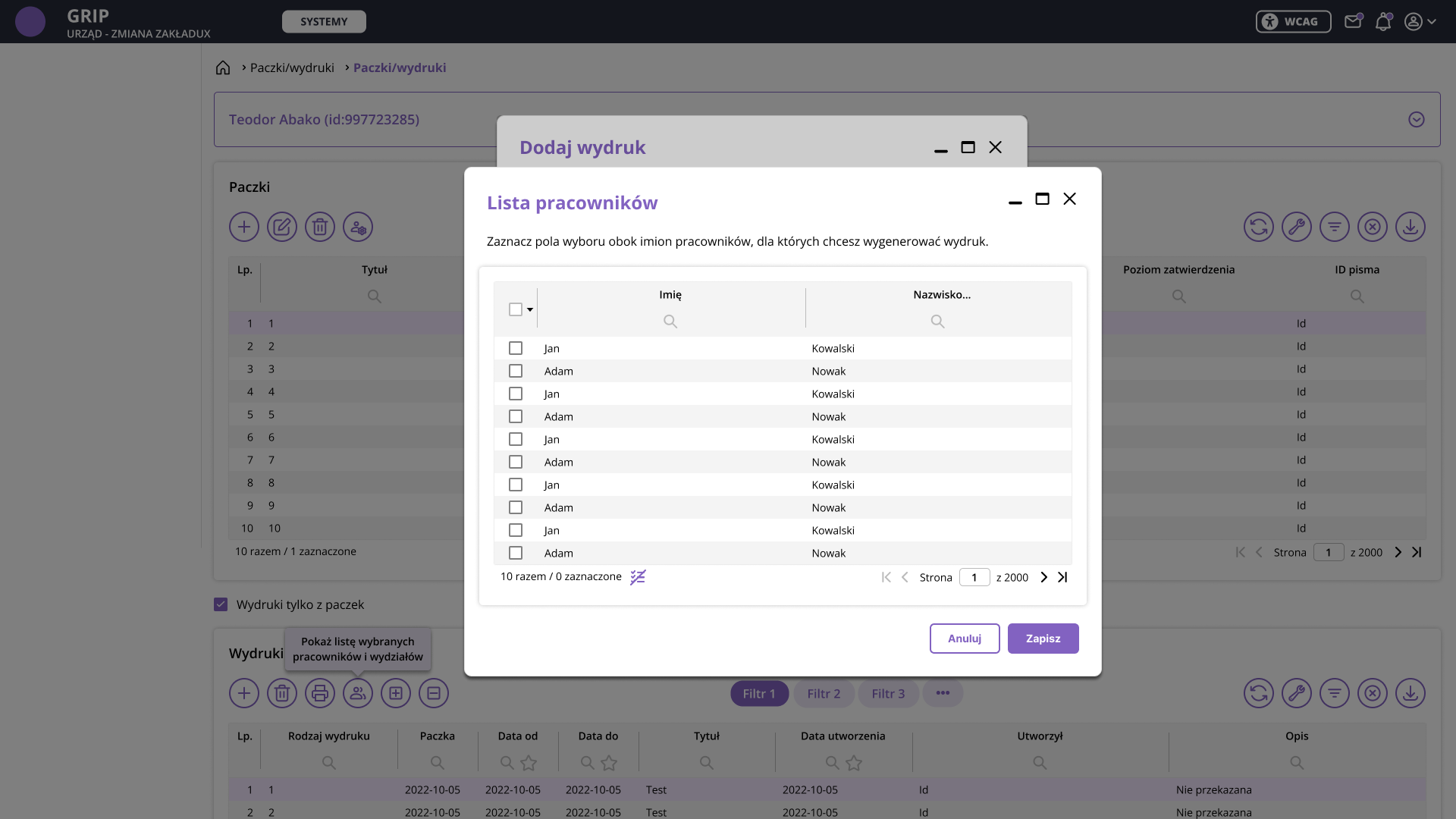
- →In the add-printout window you can pick a department via multiselect or specific employees via a list with checkboxes. Both lists are limited according to the user's permissions.
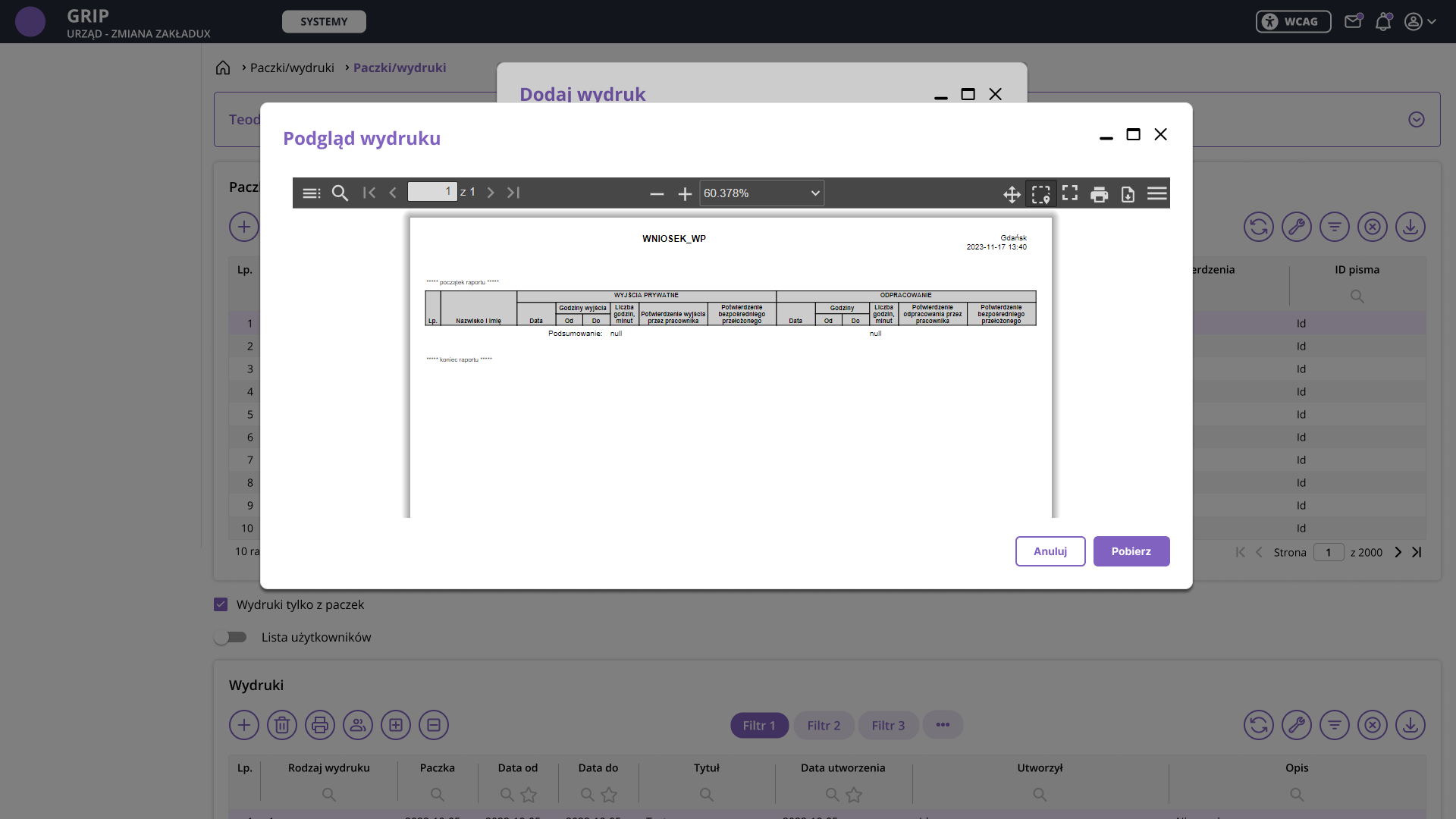
- →I shortened the process. Previously you had to prepare a report, preview it and only then save. Now after saving, the printout opens straight away for preview or download, and the save button is available the whole time.
- →I added a preview of the selected employees and departments above the table, so it's clear what a given printout concerns.
- →I removed columns from the batches table that were no longer needed.
After: a rebuilt component
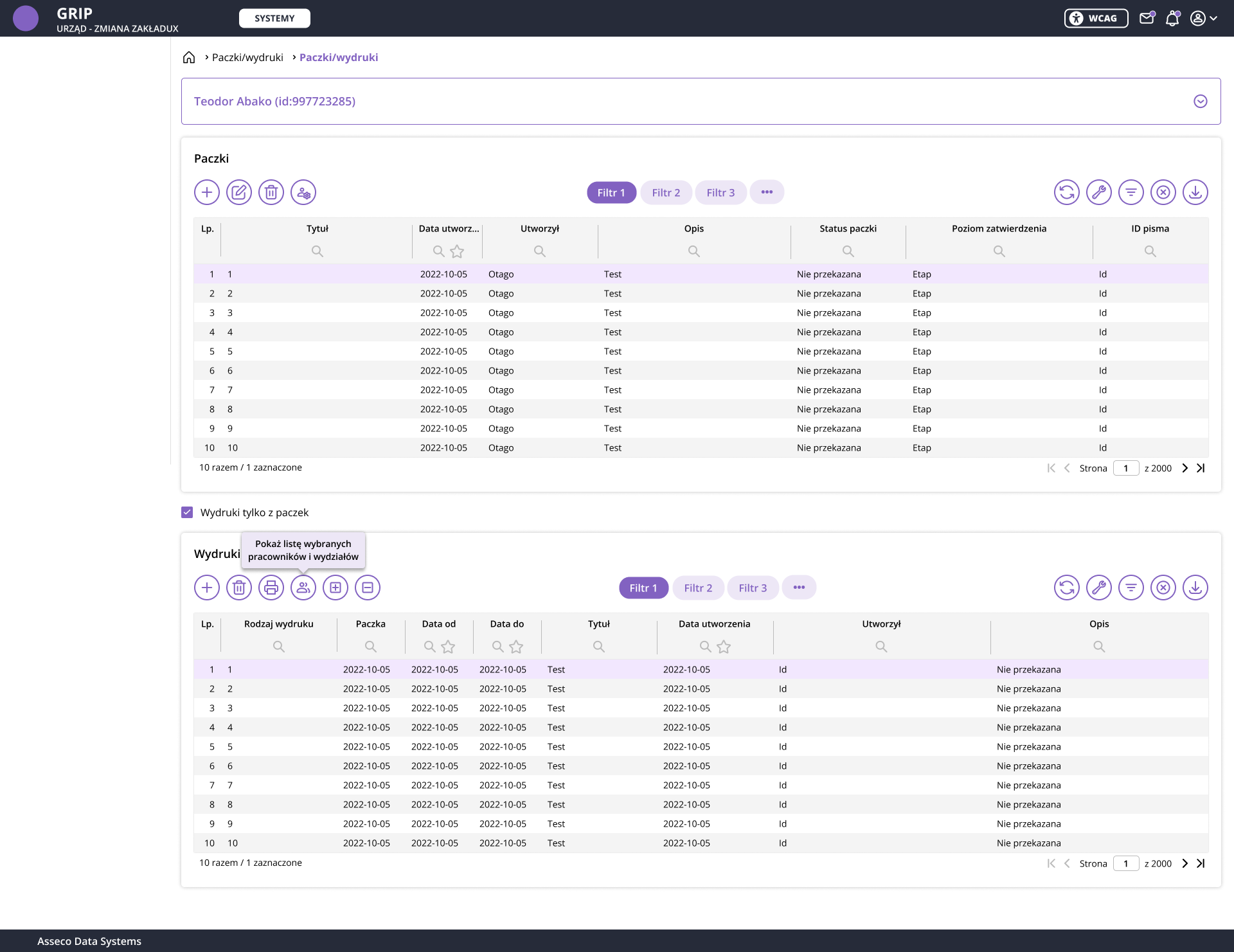
The new flow in three steps
This is another change going beyond looks: a different workflow, data selection based on permissions, and support for multiple printout formats. This kind of work is seen most deeply in the HR & Payroll project described below.
HR & Payroll project
Migrating an entire app from Forms to the new design system
A separate and demanding task within the project was migrating the HR & Payroll app from the Forms system to Angular, with a full interface redesign based on the new design system. The app handles HR and payroll processes for public institutions: complex data flows, multi-level permissions and complicated business logic.
I ran the project without a dedicated analyst, which meant I first had to understand the domain on my own. The starting point was an analysis of the existing Forms system, screen by screen, mapping data flows and decision points. Conversations with people who had worked on the system and had contact with the clerks helped me understand where processes were justified and where they had accumulated over the years without revision. I agreed every process change with the project manager.
Example: the change of employment terms screen
In the old system the screen was overloaded: dozens of fields, sections and controls crammed into one view. Through conversations with people who knew the system, I described each element: what's important and stays, what can be removed, and what to move or swap for a different component. Repetitive named fields I hid into tooltips, timeline markers I turned into an icon, expanded sections I split into tabs, and editable cells into a table component with an add button. I described each such decision in language understandable to developers who didn't know the HR and payroll domain.
The result was a tidy screen split into tabs: employment terms, organizational structure, components, secondment, competencies, replacement. Instead of one overloaded view, an interface emerged in which you only see what the clerk needs at a given moment.
Before: Forms screen analysis
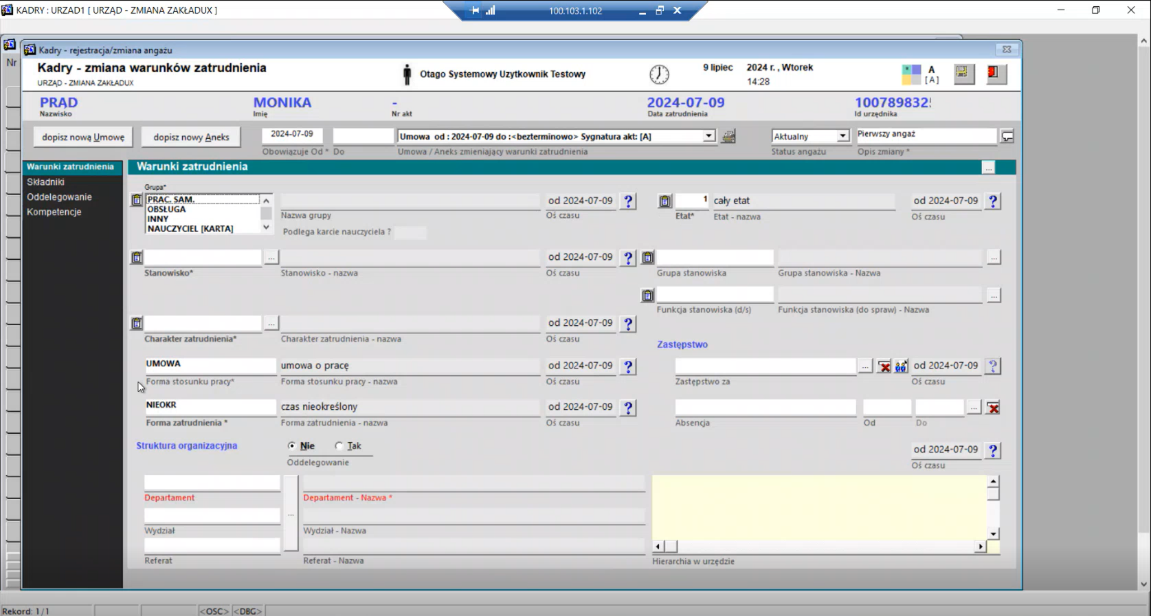
After: a screen split into tabs
The full scope of the migration required over 1,000 mockups. Each screen was a complete process analysis: the old view from the Forms system, the new view in the design system, mapped components, and described states and interactions. The documentation was created for a development team in Spain, where quick communication wasn't possible, so the specification had to be precise enough for the rollout to proceed without extra questions.
Measuring success
A design system's success is measured by adoption and consistency
A design system has no single conversion metric. Its success shows in how many apps actually use it and how consistent they've become for the clerk.
80+
apps in the ecosystem
50+
components in the library
4
WCAG accessibility modes
1000+
mockups in HR & Payroll
40+
apps rolled out
On top of this come analytical documentation for every component and one reference point for the whole ecosystem on the developer side. Qualitative proof: clients rated the new, consistent look of the apps positively. It isn't a number, but in a project whose goal was consistency and accessibility, it's direct confirmation the goal was met.
Takeaways
Working on a design system for four years differs from a one-off project in that the consequences of design decisions reveal themselves gradually, across subsequent apps and modules. The system has to work in contexts you don't yet know at the moment of designing.
Designing four color modes from the foundations changed my approach to color decisions. When the same component has to work correctly in the standard palette and in a contrast mode at once, it becomes clear which solutions were architectural.
Working on HR & Payroll without an analyst showed that understanding the domain is part of design work. Mockups are better when the designer understands the logic of the processes they're designing.