Business travel system
An internal B2B system for a large corporate group: three dedicated experiences for the employee, manager and accountant, built on a shared design system.
View the prototype ↗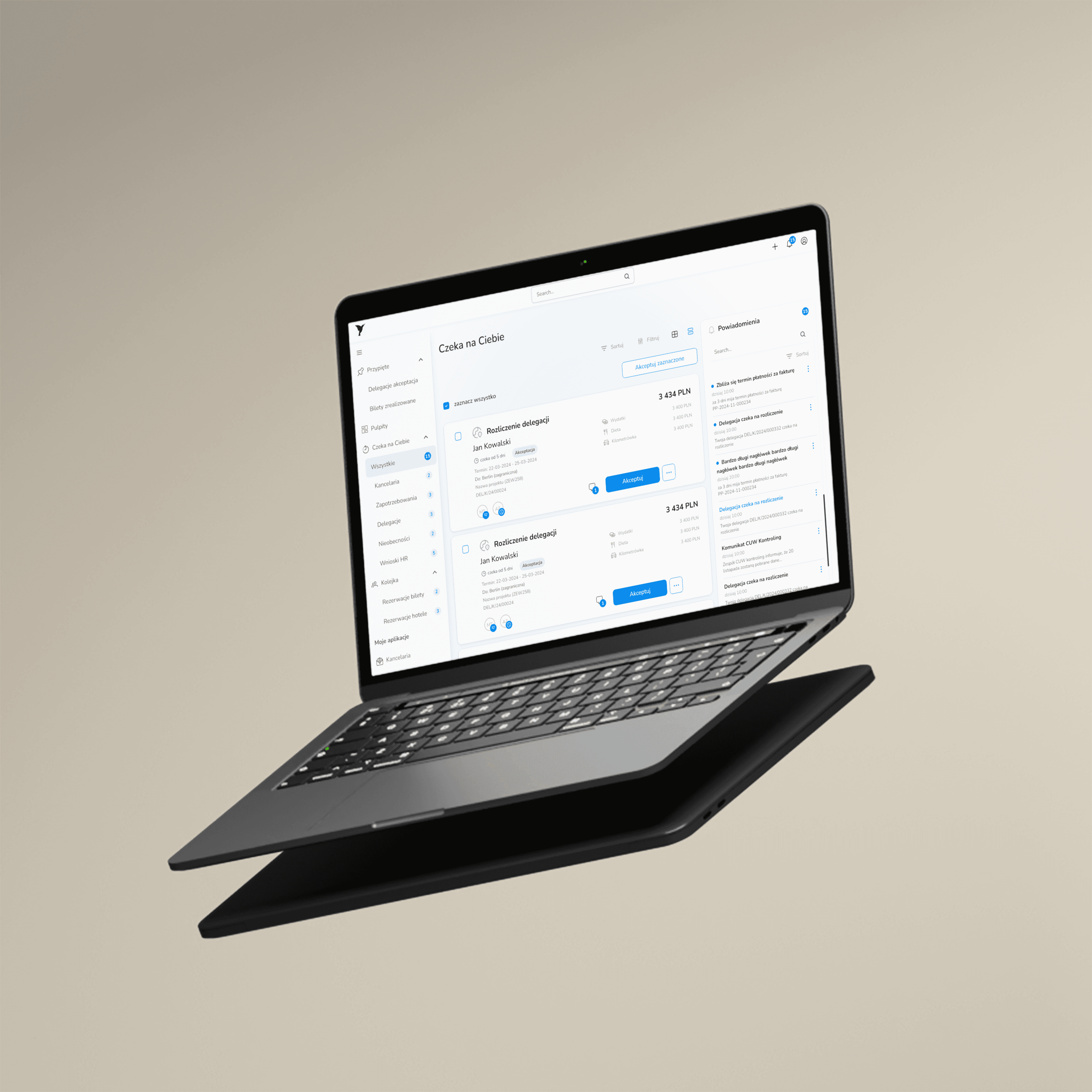
- Title
- Business travel management system
- Industry
- B2B / Technology sector
- Role
- UX Research, UI Design, collaboration with QA
- Tools
- Figma, Jira, usability testing with surveys
- Date
- October 2024 – September 2025
About the project
One app,
three completely different experiences
A year of end-to-end work: from diagnosing the old ERP and research, through designing three dedicated interfaces for each role, to rollout and usability testing with real feedback.
The project had an extra dimension: an AI-generated frontend for the first time in this team. I owned quality at the seam between Figma and code, so that what I designed actually reached users.
→Product challenge
The employee, manager and accountant have completely different tasks and success criteria in a business-travel system. One interface for all three roles meant none of them got an experience matched to their needs. The key design decision was about architecture, not looks.
→Technical innovation
The project was built with AI-generated code, a first for this team. Code came quickly, but brought discrepancies between the design and the generated interface. A design system with a token layer was the reference point that let us catch and fix those discrepancies before they reached users.
→Scalability
The design system created for Koliber was designed from the start as a foundation for the group's entire software ecosystem, based on tokens. Fleet Management already runs on the same components. The HR module is in active development.
→Outcome
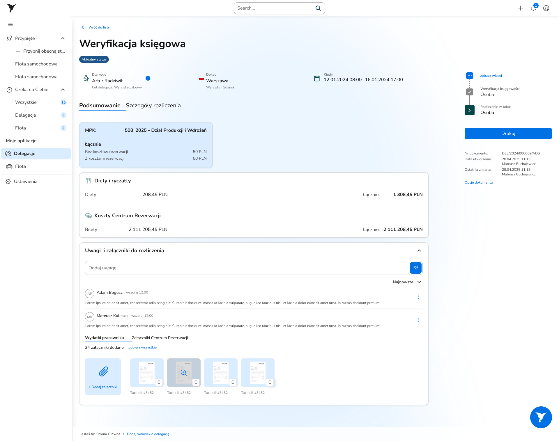
Post-launch usability testing confirmed the key flow works. The results of the settlement scenario pointed to specific things to fix and set the roadmap for the next sprints.
Problem
The old system
.png&w=3840&q=75)
.png&w=3840&q=75)
The old system looked like an internal IT product from the 2000s. Tables with 10–14 columns required horizontal scrolling to see all the data. The travel request form had dozens of fields on a single screen, with no order logic, each section built differently. Above the table, 4–5 action buttons at once with no visual hierarchy showing which mattered more. The blue and green colors served no semantic function.
Employee
Calculated allowances in Excel and emailed confirmations. Every trip required filling in the form from scratch, even for the same route every week.
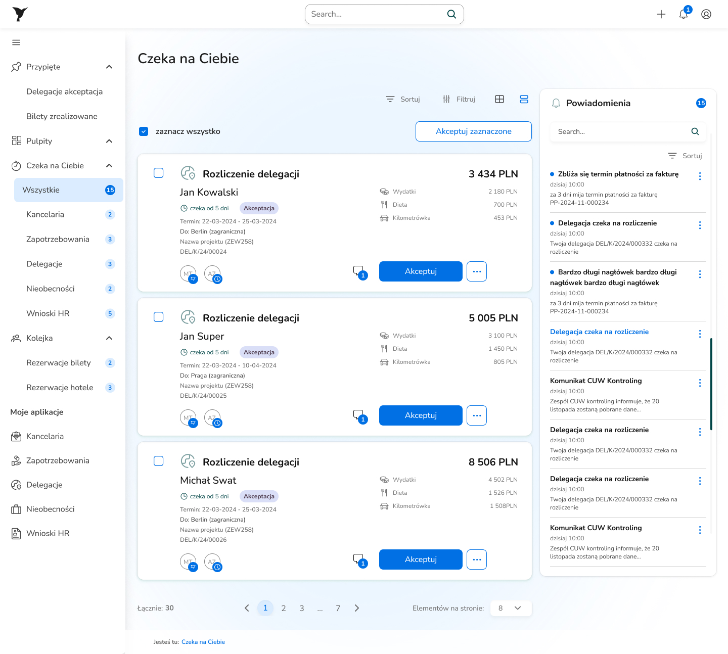
Manager
Didn't know how many documents awaited his decision without clicking into the list of all 450 records. The default view showed every document in the system with no highlight on the ones needing his decision.
Accountant
Checked the same manual-calculation errors over and over. Amounts had no breakdown by category, so to understand where a sum came from he had to call the employee.
The biggest problem wasn't in the visual layer but in the system's architecture: the same app served three groups of users with completely different tasks, priorities and definitions of success, treating them identically.
Research methodology and data synthesis
Heuristic evaluation
I went through all the key flows of the old system through the eyes of each role. Before I asked users “how much” something hurts, I knew “what and why” was broken. I mapped design-principle violations in each flow.
“4–5 action buttons at once, none more important than the others. The user has to decide what to click before they even know what they want to do.”
Stakeholder interviews
Project managers, product owners, business analysts. Two discoveries that changed the product architecture: employees often repeat the same routes, which can be used in the interface. Managers need an inbox with counters, not a rebuilt document list.
“We don't need to see all the trips. We need to see only the ones that require our decision.”
Post-launch usability testing
Three scenarios matching the key tasks of each role, with surveys, completion time and an intuitiveness rating. The data doesn't just confirm what works. It sets the roadmap for fixing what doesn't.
“The system reads the amount from the attached receipts itself.”
Jira Lifecycle Management
A continuous channel after launch: users reported problems, I discovered, documented and prioritized them in epics. Daily meetings with backend and frontend developers so every report reached the right sprint. Tests give a snapshot. Jira gives evolution.
Personas
Three roles, three definitions of success

Employee / Traveler
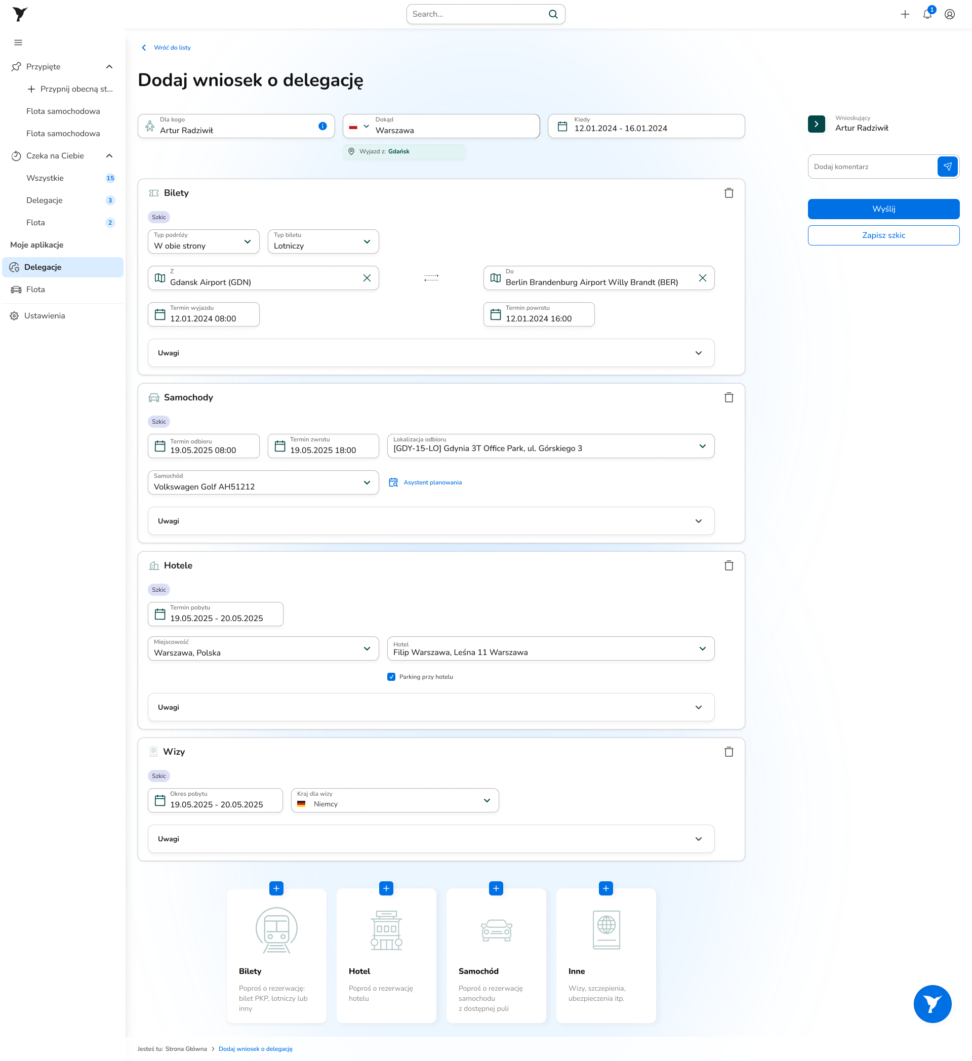
“Do I have to calculate this in Excel again?”
Submits a request between meetings, often without a desk or full focus. Wants to choose tickets, hotel and car in one place, not jump between three modules. Wants the allowance calculated by the system, with no manual math. Definition of success: request submitted, trip approved, topic closed.

Manager / Approver
“I don't know how much I have to approve, I have to click to check.”
Approves requests between other tasks. The travel system is one of many tools in his workday. He needs a single glance: how many documents are waiting, of what type, what needs action. Definition of success: knowing what's waiting without searching lists.

Accountant
“I check the same errors over and over, because employees calculate by hand.”
Verifies settlements, allocates costs to cost centers and projects. Every data error means a call, an email, a correction, a delay. Needs amounts broken down by category and confidence the numbers add up, without digging into the full trip context. Definition of success: verification finished with no questions to the employee.
Jobs To Be Done
What users want to achieve
Task
Blocker before the redesign
After the redesign
Task
Submit a travel request in a few minutes
Before
Separate forms for tickets, hotel, car; context switching and repeated logins
After
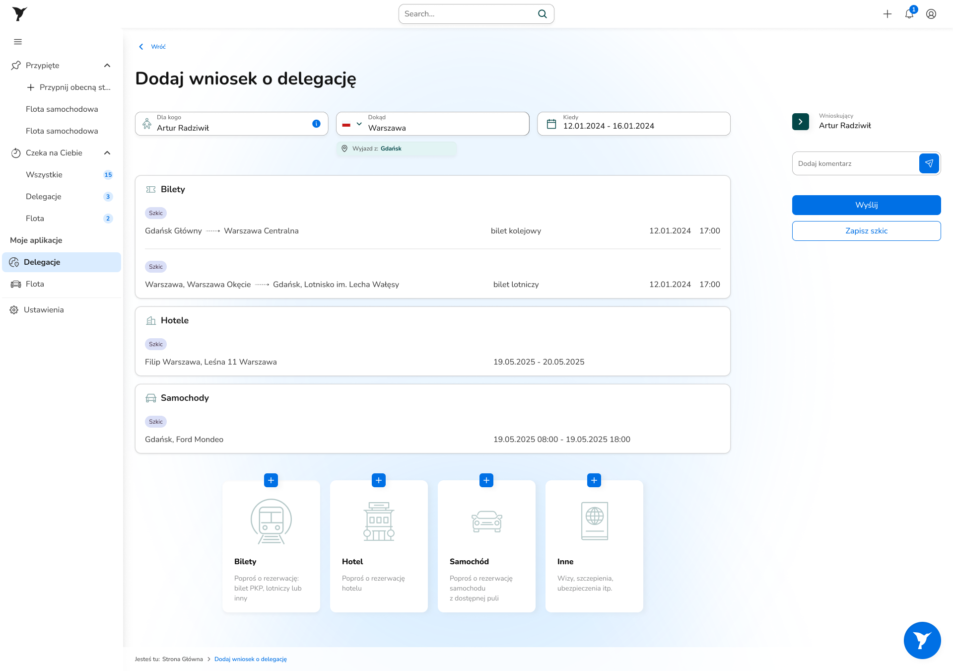
✅Trip basket: one request, all components together
Task
Know what's waiting for my action
Before
No dedicated view; the manager searches a list of 450 documents
After
✅“Waiting for you”: an inbox with counters per type
Task
Settle a trip without Excel
Before
Allowances, per-diems and mileage calculated by hand, errors enter the system
After
✅Automatic calculations built into the form
Task
Attach a receipt from the phone on the spot
Before
Upload only from a computer; a restaurant receipt needs a file transfer
After
✅5 paths: computer / QR + AI / no attachment / mileage / per-diem
Task
Understand document status at a glance
Before
Tables with no visual status, the process stage hidden in a text column
After
✅Status as a chip + the process timeline visible on the right
Task
Verify a settlement efficiently
Before
Totals with no breakdown by category; where an amount came from has to be checked by hand
After
✅Allowances and per-diems / Employee expenses / Booking Center / Mileage
Architectural decision
One app, three products
The old system had one interface for three completely different users. The employee wanted to submit a request and close the topic. The manager wanted to know what awaited his decision. The accountant wanted to verify amounts without calling anyone. None of these tasks resembled the others.
Stakeholder workshops and an analysis of the old system showed the problem was architectural. The project took a direction: three dedicated experiences in one system, each designed for a single definition of success.
Employee / Traveler
- →A travel request isn't a task the employee devotes an hour to at a desk. He does it between meetings, often in a hurry, often from his phone. There's one goal: submit the request in a few minutes and forget about it.
- →The old system required switching between three separate modules: tickets, hotel, car. Each with its own form and its own approval path. Allowances and per-diems calculated outside the system, in Excel. Every trip was a project in itself.
- →After the change, the employee submits one form containing all the components of the trip, and the allowance and per-diem calculations are built directly into the system.
Manager / Approver
- →The manager handles several employees at once and juggles dozens of other tasks. The travel system is one of many tools in his day, not the center of his work. He needs to review requests and decide efficiently, not manage a document list.
- →The old view was a table with every trip in the system. To find what needed his decision, you had to filter, click and count. To know how much he had to do, you had to go in and check.
- →The new landing view is a dedicated “Waiting for you” panel with counters showing how many trips and how many company-car bookings await a decision, visible right after logging in.
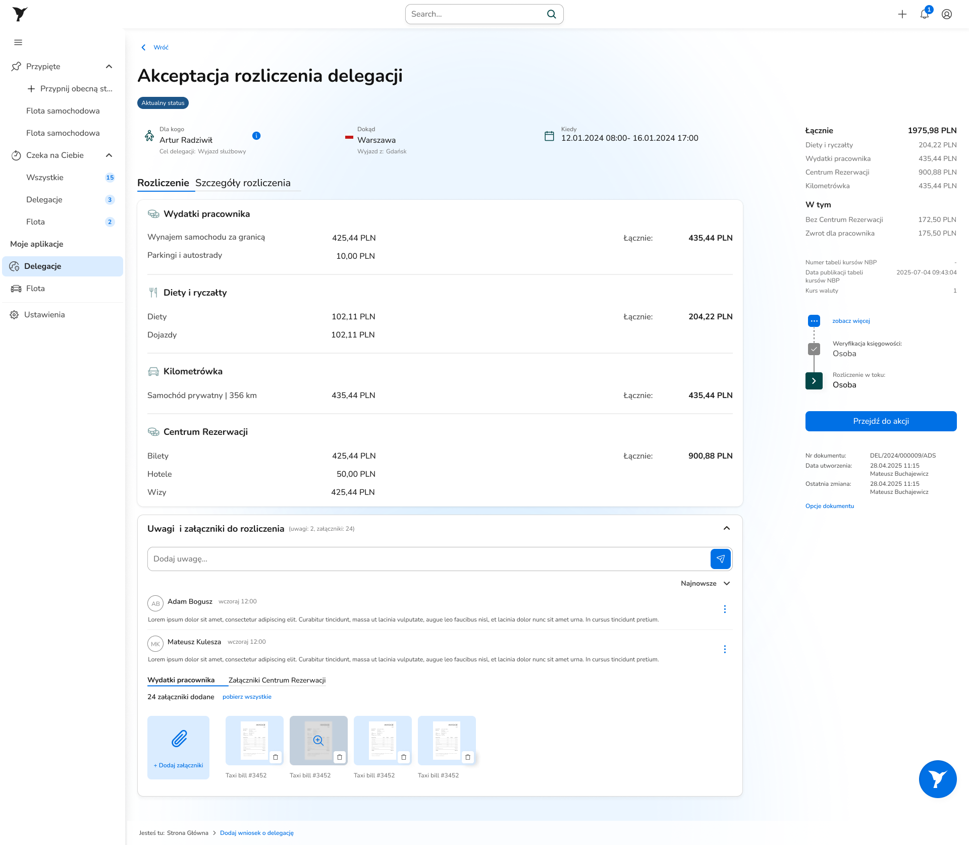
Accountant
- →The accountant needs support in settling trips not because he doesn't know the rules, but because the data he gets is inaccurate. Employees' manual calculations entered the system with errors. Every error is a call, an email, a correction, a delay. The same loop over and over.
- →The new view has a breakdown into four categories: Allowances and per-diems / Employee expenses / Booking Center / Mileage. Every amount has a source visible without asking the employee. The class of errors the accountant checked routinely disappears, because the system calculates instead of the employee.
- →Three dedicated views mean greater complexity on the development and maintenance side. That was a deliberate decision: a specialized interface for each role mattered more than simplifying the architecture.
Key design decisions
What I changed and why
Trip basket: a trip is one request, not three separate ones
Problem
The old system saw a trip as separate modules: train tickets, flight tickets, hotel, car rental. Each with its own form, its own approval path, its own context. An employee planning a week-long trip had to submit three requests that were connected nowhere.
Solution
One request form covers all the components of the trip: train tickets, flight tickets, hotel, car rental, in a single approval path. Allowance and per-diem calculations built directly into the form: the system calculates instead of the employee. The employee submits one request and closes the topic.
“Waiting for you”: an inbox instead of a list of 450 documents
Problem
The manager entered the system and saw a table with all trips: his own, approved and pending, plus trips of other managers within his permissions. All together, no division. To find requests awaiting his decision, he had to filter. To know anything was waiting at all, he had to remember to check.
Solution
A dedicated landing view built around one question: what awaits my decision now? Counters per module: how many trips, how many absences, how many HR requests, visible right after logging in. Approval can be done straight from the request card. Plus an in-app and work-email notification system. Clicking a request opens the full task view with a financial settlement broken down by category, comments and attachments, and a Camunda panel with the current process state and an action button.
Automatic calculations and a personalized data view
Problem
Allowances, per-diems and mileage were calculated outside the system, in spreadsheets. Results pasted into the form, often with an error. The accountant caught those errors during verification and had to go back to the employee with a question, the employee corrected it, the cycle started over. The same error, the same loop, over and over. A separate problem: one default table layout for all roles meant everyone saw columns that didn't concern them.
Solution
Calculations built directly into the form. The system calculates allowances, per-diems and mileage in real time from the data entered in the request. The employee sees the amount, the accountant sees where each amount comes from, with no question to the employee. Plus a table with advanced filtering and the option to configure your own view: the user picks the columns they need, saves them as a named view and returns to them whenever they want.
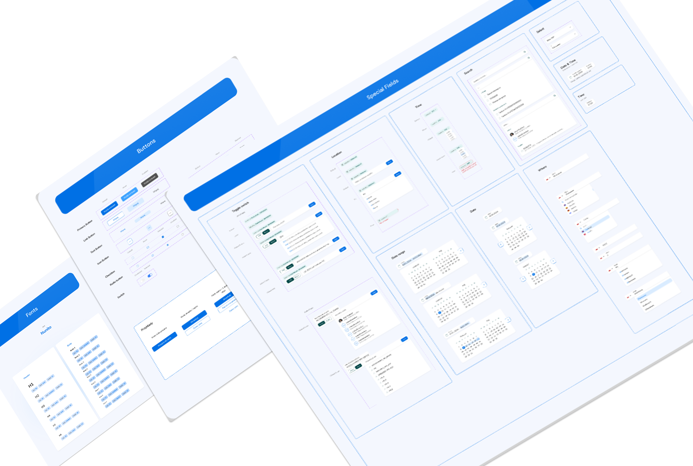
Design system and AI
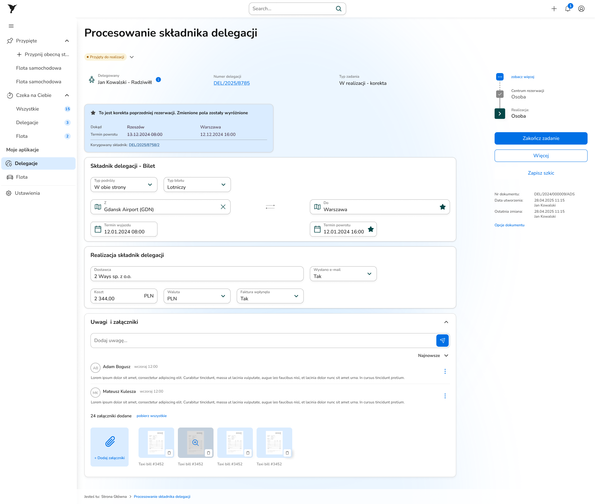
Problem
Koliber was to be the first app in this team whose frontend was built with AI. Code came quickly, but didn't always look like the design. Without a shared reference point it was hard to say where something diverged and why.
Solution
A new design system was built for Koliber: a component library with a token layer defining colors, typography and spacing as named values. Tokens turned out to be the answer to the AI-generated-code challenge: the discrepancy between the design and the generated code became visible as a concrete, measurable difference. Prototypes in Figma Make began to appear for validating new solutions. The design system went beyond one project. Fleet was built on the same components and tokens, and the HR module is under construction.
Interactive prototype
Try the system
Click around the interface, below is a working prototype built in Figma Make.
Measuring success
Post-launch usability testing
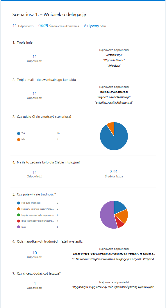
After launch I ran usability testing with surveys: three scenarios matching the key tasks of each role.
Travel request
The key flow held up in testing. Most participants got through the scenario without major trouble. But there were observations for further work: an unclear button on the request details view and a problem booking a flight ticket, which didn't behave as expected. Participants also raised a suggestion that came up in several responses: the option to enter the departure time directly in the request.
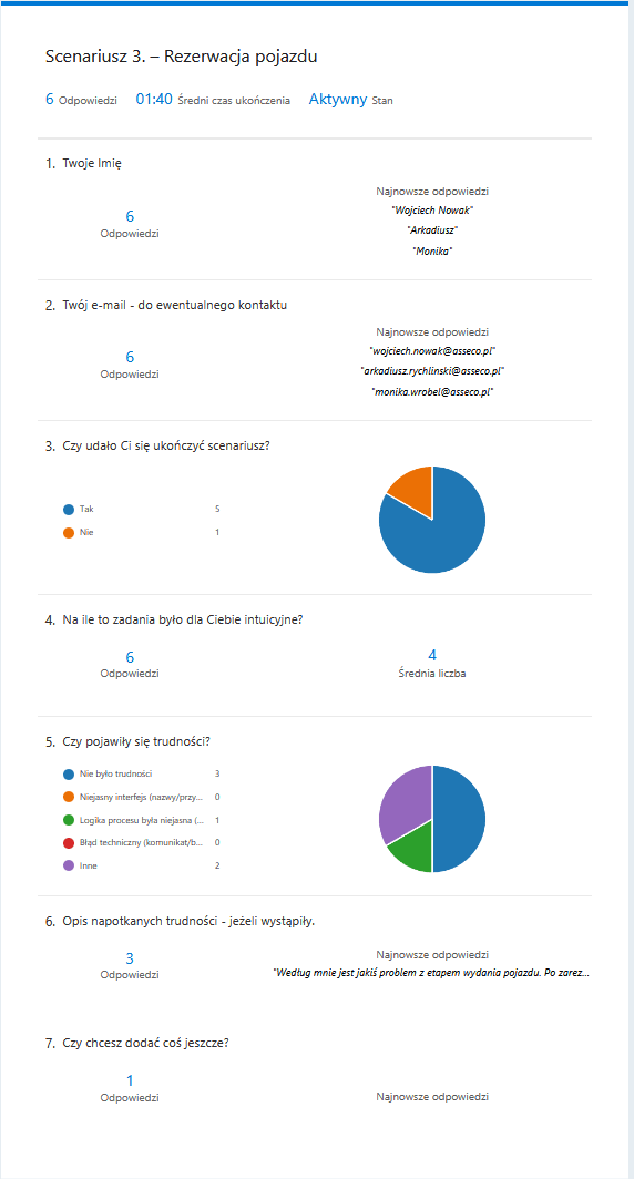
Vehicle booking
The shortest scenario, the cleanest result. Most participants finished it with no trouble: the simplified, separate flow worked. One point needing attention: the vehicle handover stage after booking was unclear. Participants knew the booking was submitted, but didn't know what should happen next or what to expect.
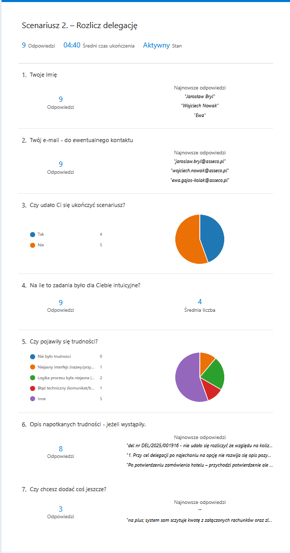
Trip settlement
The hardest scenario. None of the participants finished it without trouble: some were blocked by a technical error on a specific test trip, some struggled with tooltips on settlement items that didn't expand on hover. On the plus side: participants noticed and openly appreciated the automatic reading of amounts from receipts.
The settlement results directly set the roadmap for the next sprint: fixing the technical error blocking the flow, improving tooltip behavior with item descriptions, clarifying the next steps after a vehicle booking. In parallel, users report issues and bugs through Jira, which I prioritize in epics and route to the next sprints.
Takeaways
What this project taught me
The heuristic evaluation and stakeholder workshops gave the answer before I designed anything new: the interface didn't need a refresh, it needed redesigning from the foundations. Three roles with three completely different definitions of success couldn't share one view and each get a good experience. That diagnosis set the direction for the whole project and preceded every design decision.
Post-launch usability testing brought two pieces of information. The key travel-request flow worked as it should. The settlement scenario revealed specific things to improve: a technical error blocking the flow, unclear tooltips with item descriptions, an imprecise message after a vehicle booking. Each of these points went into the next sprint's roadmap.
The design system created for Koliber proved itself in several contexts at once. As a component library it sped up work on subsequent screens and ensured visual consistency. With AI-generated code, tokens became a reference point that made the discrepancy between the design and the generated code visible as a concrete difference to catch before it reached users. Fleet already runs on the same components and tokens, and the HR module is under construction.