System Fala
A comprehensive redesign grounded in an analysis of 100+ reviews, IDI interviews with passengers and a 25-page heuristic audit. The project focused on unifying the purchase interface and the ticketing features.
View the prototype ↗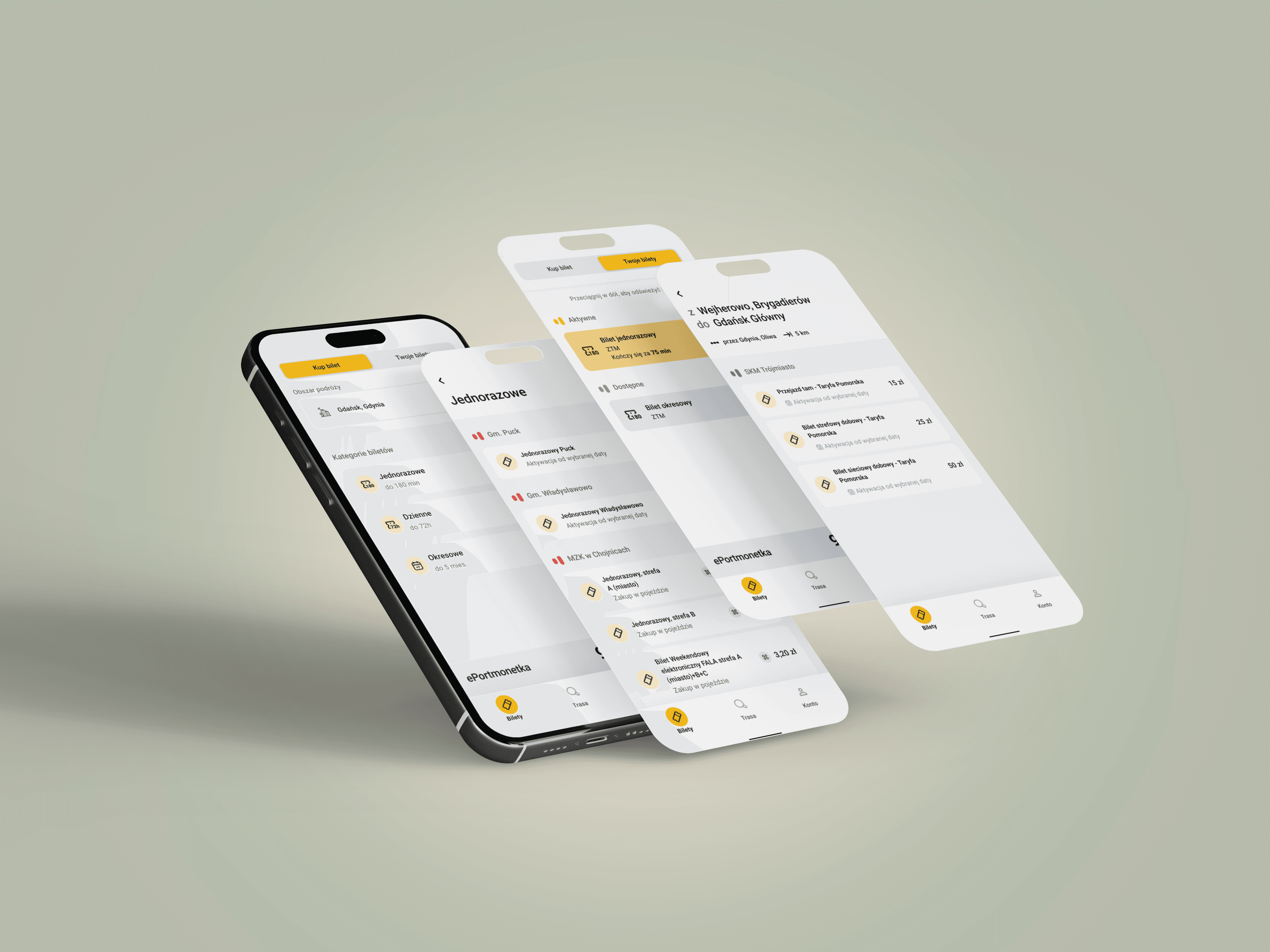
- Title
- System Fala
- Industry
- B2C mobile app / Public transport / Public sector
- Role
- UX Research, UI Design, collaboration with QA
- Tools
- Figma, App Store / Google Play analysis
- Date
- 2026
Overview and market context
System Fala is an integrated ticketing ecosystem covering urban and rail transport in the Pomeranian Voivodeship. Since August 2025, after the consolidation of season-ticket sales channels, the app became the main regional transactional platform for mass transit. That change caused a sharp rise in transaction volume, putting the interface in front of the challenge of instantly serving a diverse passenger base. The clash between system assumptions and user opinions (review mining) pointed to an urgent need for solutions that increase travel confidence under limited network access.
→Business challenge:
Locating and eliminating critical points of cognitive friction (low-hanging fruit) to rebuild passenger trust and improve the app experience.
→Primary goal:
Simplifying ticket search (a geographic city selector) and implementing a safe, stress-free offline mode for ticket inspection.
→Technical pragmatism:
Respecting and keeping the stable, proven functional patterns of the system with minimal developer effort.
→Inclusivity (Accessibility):
Bringing key interface elements, in both the standard and simplified versions, in line with WCAG 2.2 AA, ensuring legibility in difficult conditions.
Discovery
4 research methods
Informal user interviews
I talked with people who use Tricity public transport every day. The conversations were casual, which is exactly why they were honest. I learned about emotions that never make it into reviews: Marta gets stressed at the mere sight of an inspector on the tram, because she doesn't know whether the app will open and whether she'll manage to show the ticket in time.
“When an inspector gets on, I already know there'll be a problem.”
Heuristic analysis
I went through all the key flows in the app and documented violations of interaction design principles. I identified 16 problems across 6 areas: operator selection, route search, ticket purchase, performance, visual hierarchy, onboarding. This method reveals what is broken. Reviews tell you how badly.
Review mining (67 reviews)
I thematically analyzed 40 App Store reviews and 27 Google Play reviews. Three themes dominated: session (logged out on every open, after every update), no offline mode, and an unintuitive ticket purchase. Users couldn't find their way to the purchase, gave up and bought paper tickets. A separate category: users don't understand what they're buying, ticket descriptions didn't exist, and the helpline couldn't explain either.
“Every time I want to show a ticket I have to log in again. At the inspection that's genuinely stressful.”
Competitor benchmark
I compared Fala with JakDojade, moBilet and SkyCash on 13 criteria. Fala was the only app with no offline mode. That's a standard SkyCash shipped back in 2014. All three apps use clear ticket names: “single”, “daily”. Fala had “Short-term” and “Long-term”.
Personas
Four types of users

Marta
Commuter
Commutes daily from Gdańsk to Gdynia. She gets stressed at every inspection, not knowing whether the app will open or the ticket will be available. Goal: the monthly pass always at hand, zero stress with the inspector.

Tomasz
Occasional rider
Looks for a single ticket in 30 seconds. He gives up and buys a paper ticket when the flow takes more than 2 minutes. He doesn't understand the difference between ZTM, ZKM and SKM.

Kasia
Tourist
Doesn't know the operator structure. She bought the wrong ticket because the interface reflected an institutional split, not her mental model. She couldn't check prices without creating an account.

Sławek
SKM rider
Told his friends that “Fala doesn't support SKM”, because the interface gave no hint how to navigate it. The misinformation spread.
Jobs to be Done
What the user wants to achieve
Buy a ticket as the bus approaches
Blocker (before)
Operator selector not visible as a control, 30+ tickets with no structure
After the redesign
New selector with grouping, simplified categories, Tickets first in the nav
Show a ticket at inspection with no signal
Blocker (before)
No offline mode
After the redesign
Offline mode shipped
Understand ticket status in 2 seconds
Blocker (before)
No QR code status, poor contrast, price hidden
After the redesign
Status header, white QR background, price visible
Choose the right operator
Blocker (before)
Flat list with no grouping, selection via a tiny radio button
After the redesign
Urban transport / Rail split, full-row toggle, transport icons
Understand the offering as a new user
Blocker (before)
Names Short-term / Long-term with no time context
After the redesign
Single / Daily / Period with a time description
Key design decisions
What I changed and why
Operator selector
Problem
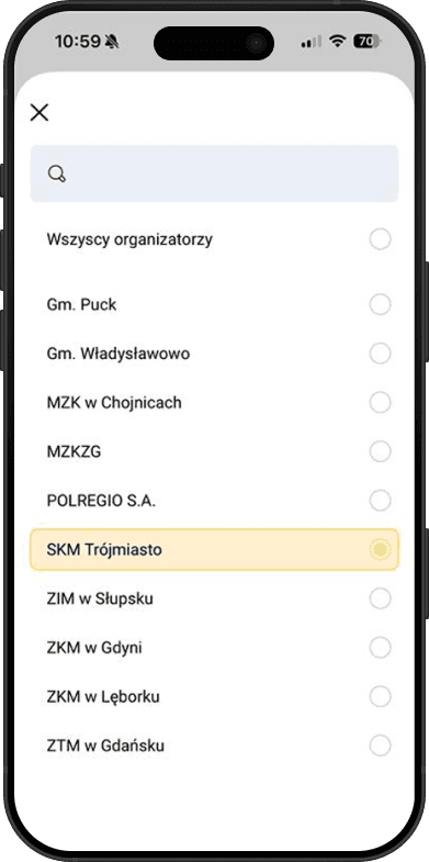
In the old version of the app the operator selection field was practically invisible. The user landed straight on the ticket list, and depending on the category there could be up to fifty on one screen. No filtering, no structure. On top of that the operator list used official institutional names: MZKZG, ZKM in Gdynia, POLREGIO S.A. For someone who doesn't know the administrative structure of Tricity transport, those abbreviations mean nothing.
Solution
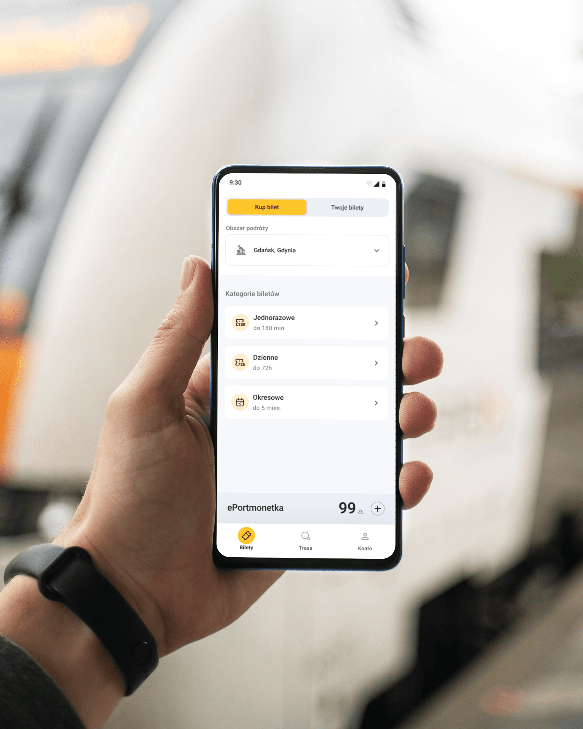
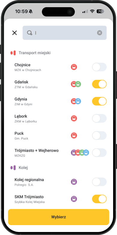
I redesigned the selector field itself, now it's clearly visible, looks like a control you can tap, and unambiguously signals that choosing an area is required. I changed the operator list from official institutional names to geographic names by city (Gdańsk, Gdynia, Lębork) with transport-type icons and a full-row switch instead of a tiny radio button. I split operators into two groups: Urban transport and Rail. I removed the “All operators” option, now choosing an area is the first step and the ticket list filters immediately.
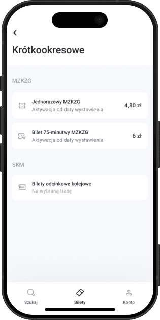
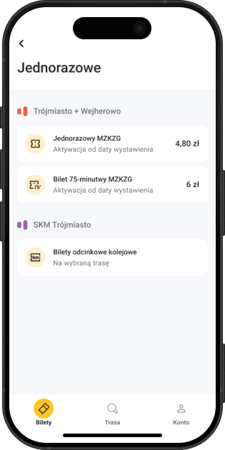
Ticket categories
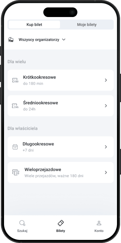
Problem
The category names (Short-term, Mid-term, Long-term, Multi-ride) said nothing about what was inside. To find the right ticket, the user had to go into each category one by one and check its contents. None of the names gave a hint of what to expect.
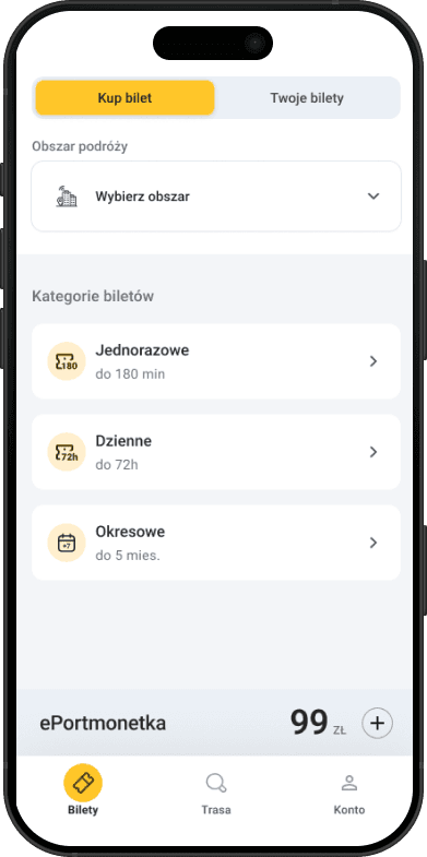
Solution
I changed the names to Single / Daily / Period, with the validity time described right in the label: up to 180 min, up to 72h, up to 5 months. The user immediately knows what's in each category, without having to go inside. These names also work in other transport apps. A user who knows JakDojade or moBilet already gets it.
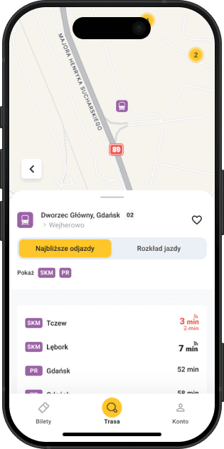
SKM connection list
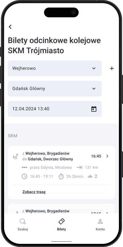
Problem
The results list for a rail route shows SKM and Polregio services, but gave no signal that you could buy a ticket from here. There was no button. To reach the purchase, you had to know you should click deeper into a specific service. Many users simply didn't discover this and left the app, not knowing the purchase option existed.
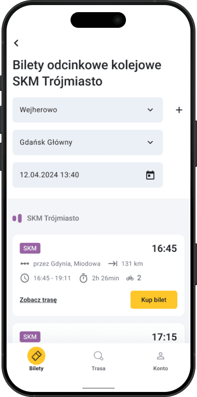
Solution
I moved the “Buy ticket” button directly into the results row, visible on every service, with no need to go deeper. This change doesn't just make buying easier, it can directly translate into more transactions: users who previously couldn't find the purchase path now see it right away. If measurement were possible, I'd watch the funnel conversion rate: the share of users who searched a route and finished with a purchase. A rise in that metric would directly confirm this change worked. I also added “SKM” / “PR” chips on each service (purple, consistent with the rail color system) and enlarged the departure time, the most important information when choosing a service.
Offline mode and ticket view
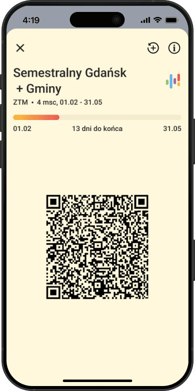
Problem
The app required an internet connection to display a purchased ticket. In the metro, in a tunnel, with a weak signal, a valid ticket became unavailable. Exactly when it was needed most: at the inspector. The ticket view itself didn't help: the QR code had no clear validity status, there was no white background under the code (poor contrast when scanning). The price wasn't visible at all, the user only saw it at purchase. Meanwhile inspectors often verify a ticket by its price, to quickly judge what type it is.
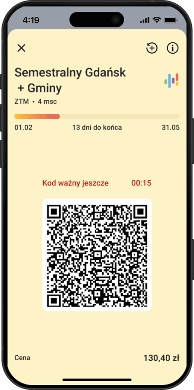
Solution
Offline mode was shipped: the ticket saves locally after purchase and is available with no connection. Internet is only needed for the purchase. In parallel I redesigned the ticket view: I added a QR validity status with a countdown (“Code valid for 00:15”), a white background under the code for legibility when scanning, and the ticket price visible on the ticket screen, for the user and for the inspector. The screen background was changed to a warm yellow (#FEF3C7), consistent with the app's color system and instantly recognizable.
Color system
Before
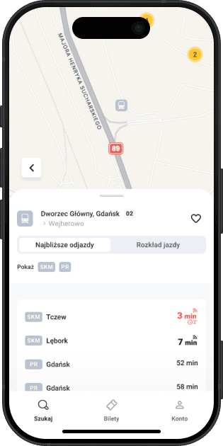
Problem
Rail (SKM and Polregio) was marked in gray in icons and visual elements. Gray on a map and in lists is easy to miss. The Fala logo has four colors, three of which were already assigned to specific modes of transport. The fourth, purple, served no semantic function in the interface.
After
Solution
I assigned purple to rail. The color already existed in Fala's visual identity, it wasn't taken, it just needed meaning. SKM and Polregio are now consistently marked in purple across chips, icons and section headers. On the map and in the results list, rail is instantly recognizable and doesn't get lost in the background. To the ticket section headers I added graphic elements referencing the system's logotype, they help the user orient within the offering and navigate quickly between sections.
Results
What changed
Offline mode eliminates the most frequent P0 from the reviews and closes the only gap against the Polish market of transport apps.
The redesigned operator selector removes a barrier users couldn't even name.
Simplified categories and a consistent color system shorten the time to first purchase.
The rollout has just finished. There's no data yet. It would be dishonest to pretend there is.
If I had access to analytics, I'd measure effectiveness with the HEART framework:
- Happiness
- Store rating as the baseline. I'd care not just about the average, but about the shift in the tone of reviews concerning ticket inspection and offline. Those two themes dominated the mining and should disappear after the redesign.
- Engagement
- Whether users come back to the app instead of buying paper tickets. If not, the app still doesn't earn trust.
- Adoption
- The share of tickets opened in offline mode. That's direct proof the new feature works and users trust it.
- Retention
- Activity after 30 days. For an app with a monopoly this is an especially important metric: high retention means users are using it by choice, not under compulsion.
- Task Success
- The funnel conversion rate: route search → ticket purchase. The main metric for the decision to move the “Buy ticket” button onto the SKM connection list.
To prioritize the next changes I'd use the opportunity score from JTBD: how important a job is to the user minus how satisfied they are with it. Where the gap is largest, the problem is most real.
Interactive prototype
Try the app
Click around the interface, below is a working mobile prototype built in Figma Make.